Blacksheep, one of the UK’s leading creative agencies, unveils the design of its latest project, Union Jacks, part of a continuing partnership with renowned British chef, Jamie Oliver. The new restaurant concept, located in the heart of London in Central St Giles, is the sixth project that Blacksheep has completed with Jamie Oliver, following a successful rollout of his first restaurant chain, Jamie’s Italian.
Union Jacks, situated in the iconic Lego building designed by architect, Renzo Piano, takes diners through a journey of discovery through Britain using familiar flavours, cooked and presented the Union Jacks way. The incredible flatbreads and wood-fired cooking methods nod to traditions that are universally loved and nearly all of the toppings are local. Setting the flatbreads apart from the array of other options on offer in Britain’s high street restaurant chains is Oliver’s partnership with US ‘pizza master’, Chris Bianco, widely credited as ‘the man who perfected dough’. It is a union of ideas, traditions and of people.
Blacksheep was brought on board once again to create a design concept that would take the Union Jacks experience countrywide. The design agency’s creative approach was to encompass the look and feel of the principle elements of the restaurant: service, food, theatre and ambiance. The agency worked hand-in-hand with Jamie. His love of British culture and heritage and his enthusiasm for encouraging the nation to eat better was a central theme for the interior design of the project.
Jo Sampson, Creative Director of Blacksheep, comments: “When working with Jamie, as with all our clients, we try and capture ‘him’, not a pastiche of his character or the best bits -simply his genuine spirit and honest approach to food and wider ethical concerns, and that is what is emulated in the design of Union Jacks.”
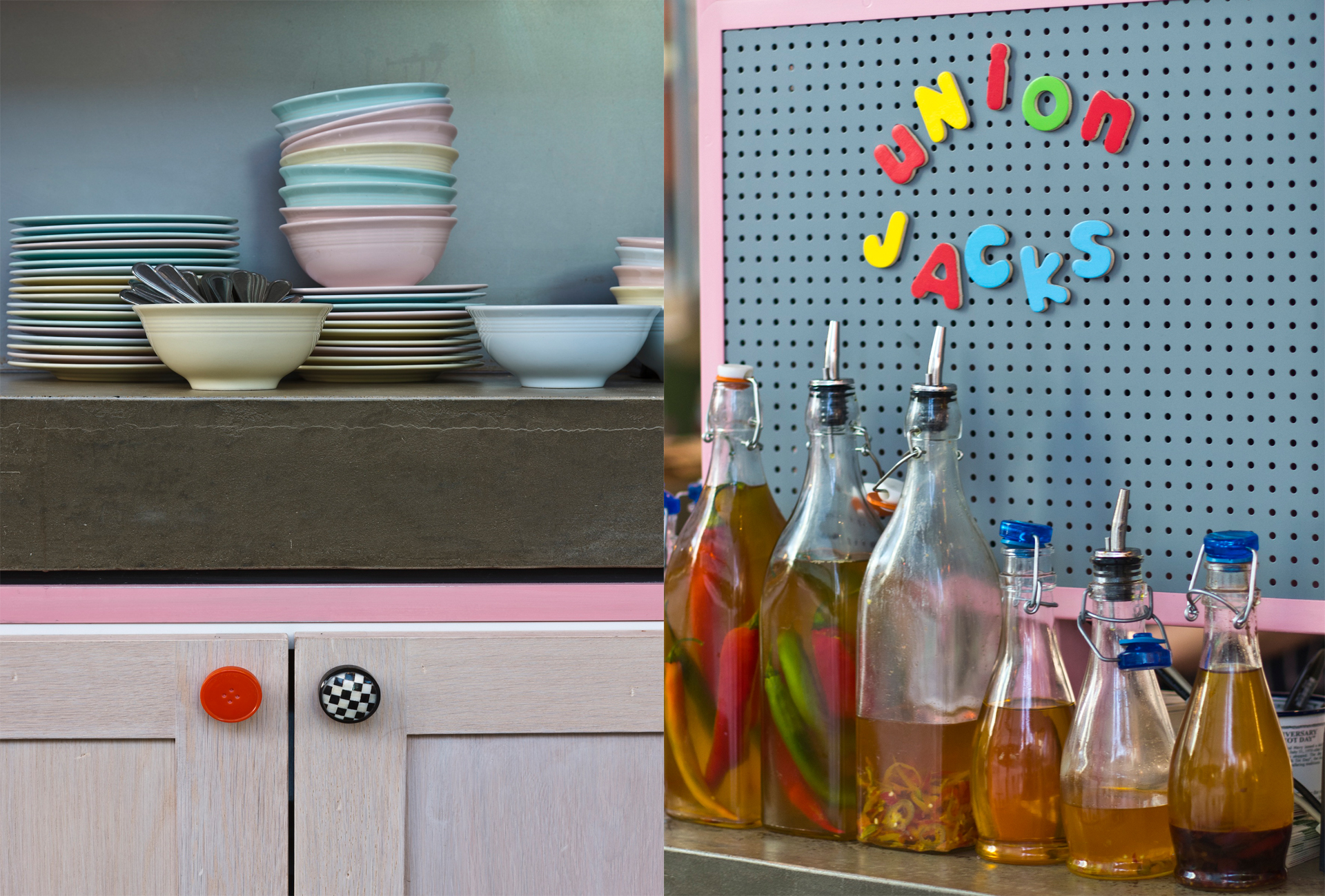
The spirit of Britishness is celebrated throughout Union Jacks; the food, the drink and the design are all underpinned by strong family values. There is a nod to yesteryear and subtle references to post-war nostalgia, including beralware-inspired plates with a cheeky twist that, when turned over, read “stop looking at my bottom”.
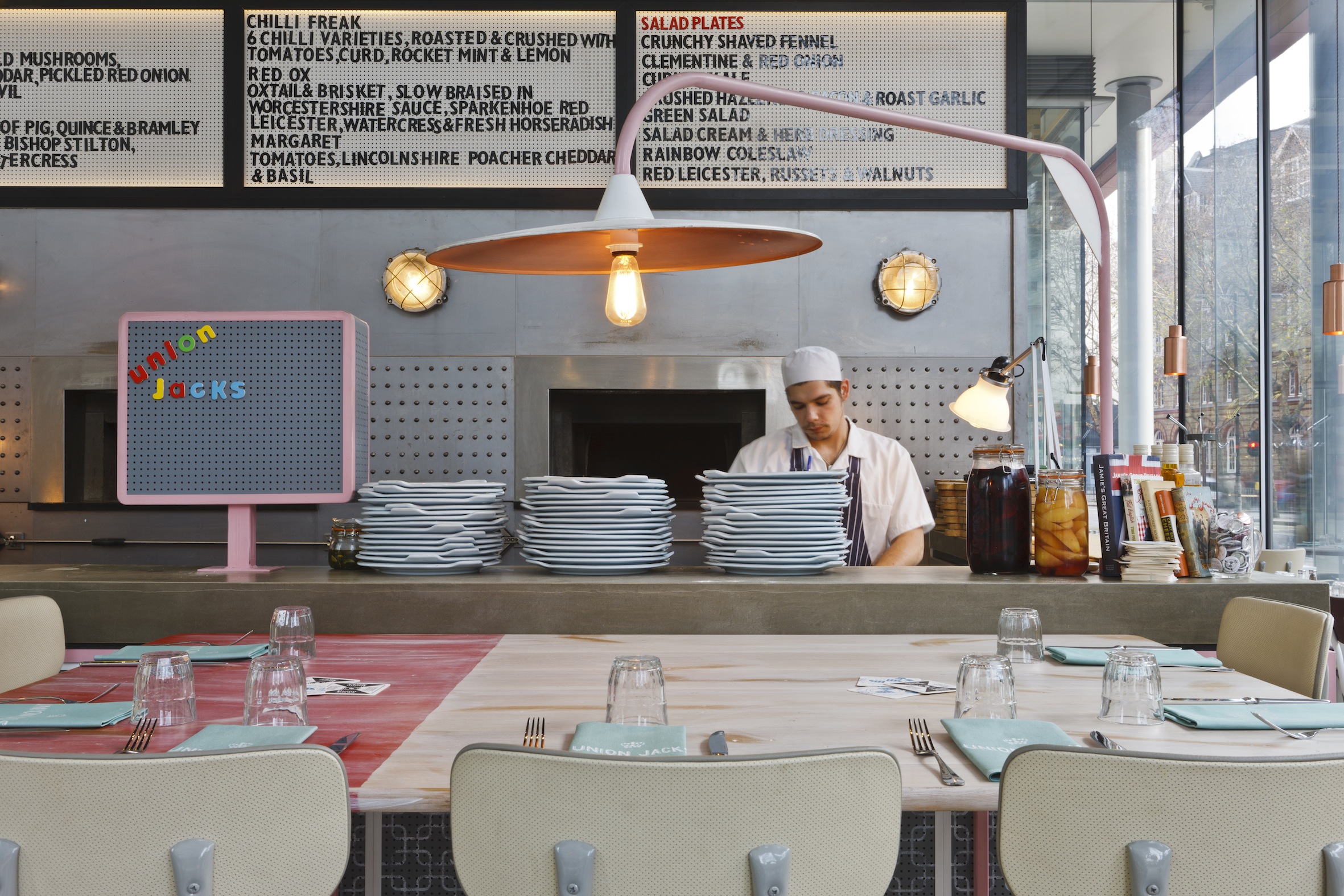
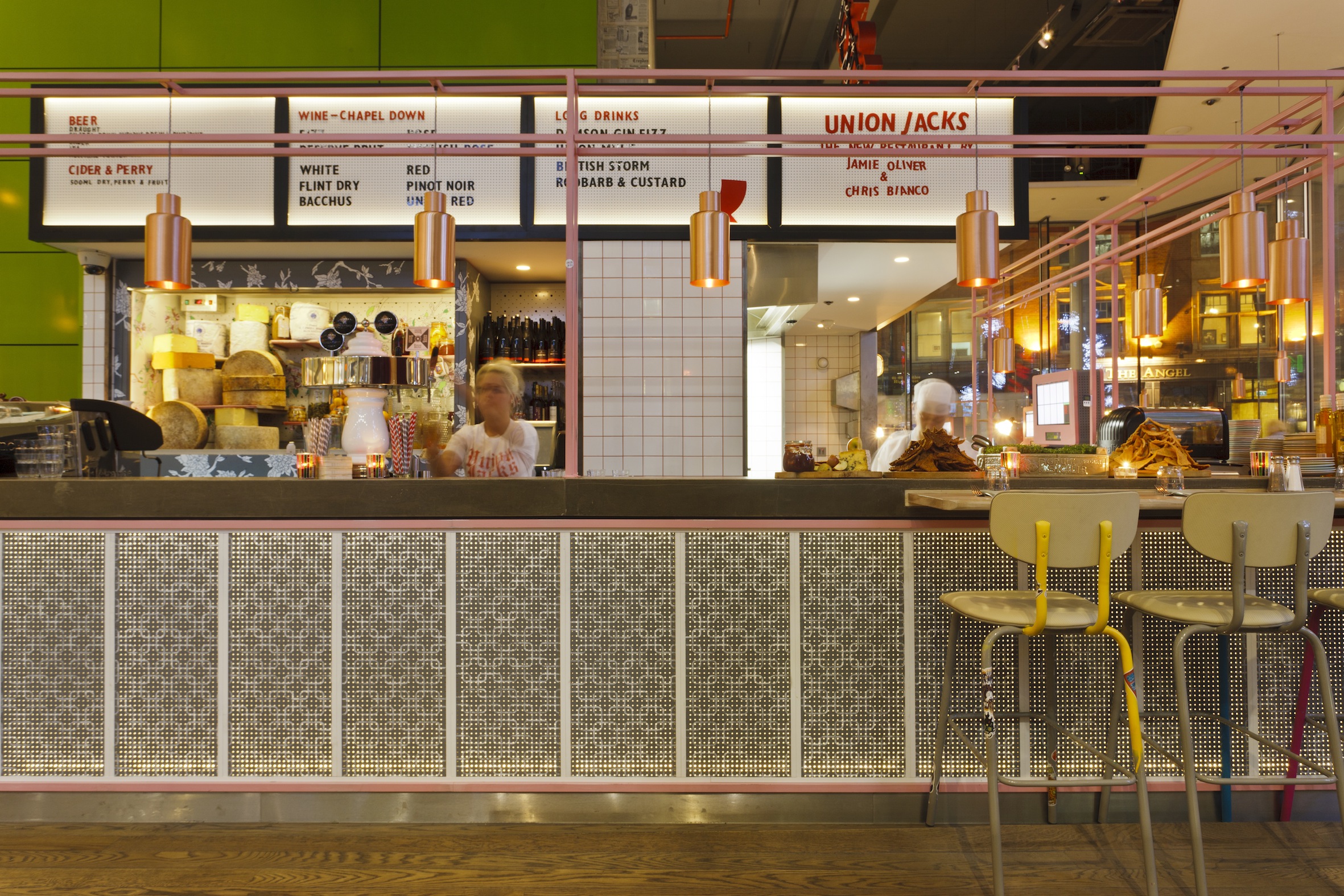
Above the bar and work station, a graphic neon multicoloured ‘Union Jacks’ sign sits above a large vintage cinema style board that displays the menu and specials.
The colour palette combines muted blue, brown, grey and pink with primary brights. Objects collected by Jamie on his travels inspired the space and retro elements that appear to be found trinkets have been made bespoke by Blacksheep and are dotted around the restaurant. Knitted 1970’s style tea cosies are found on the teapots on the café tables outside.
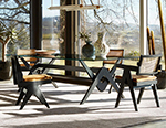
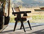
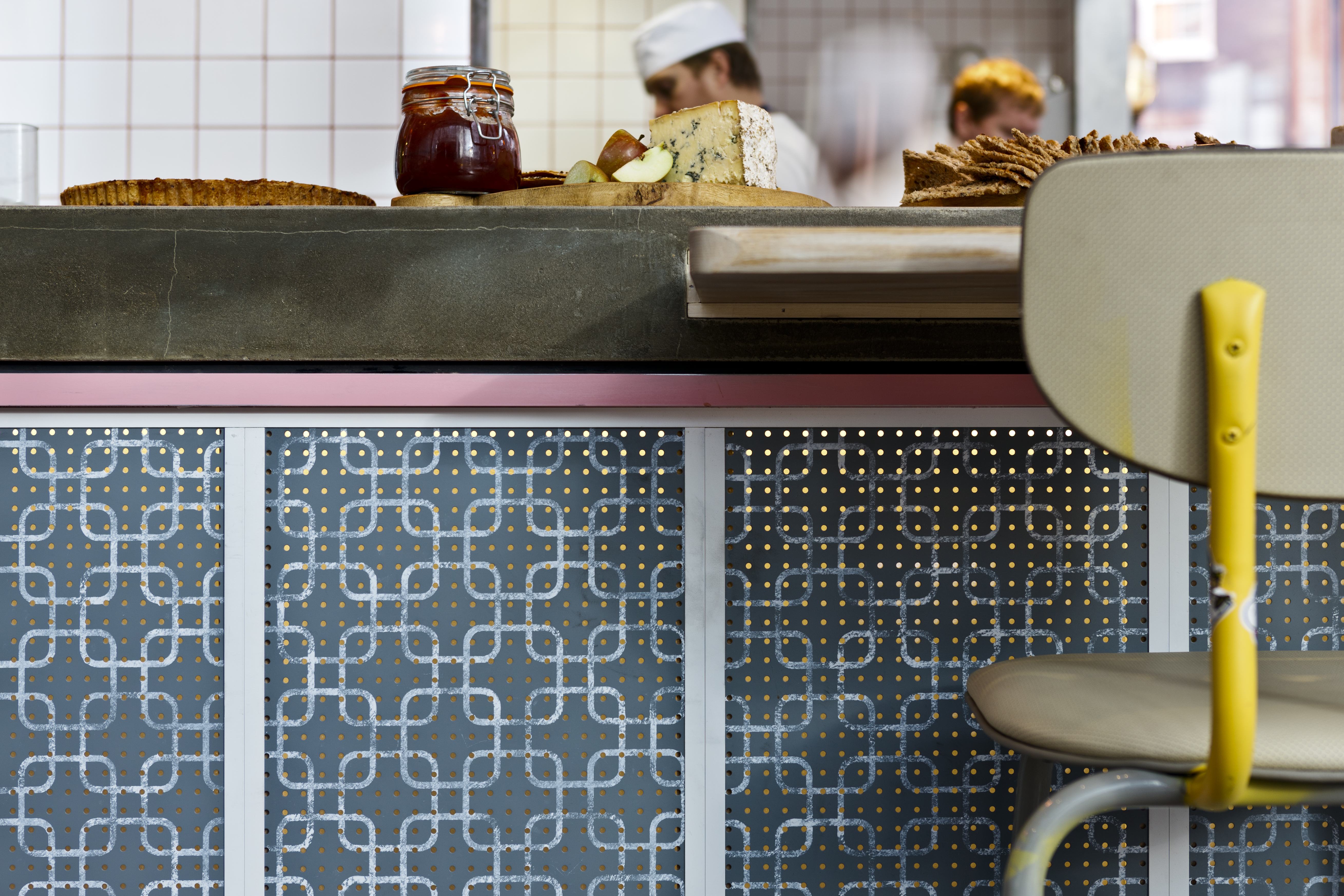
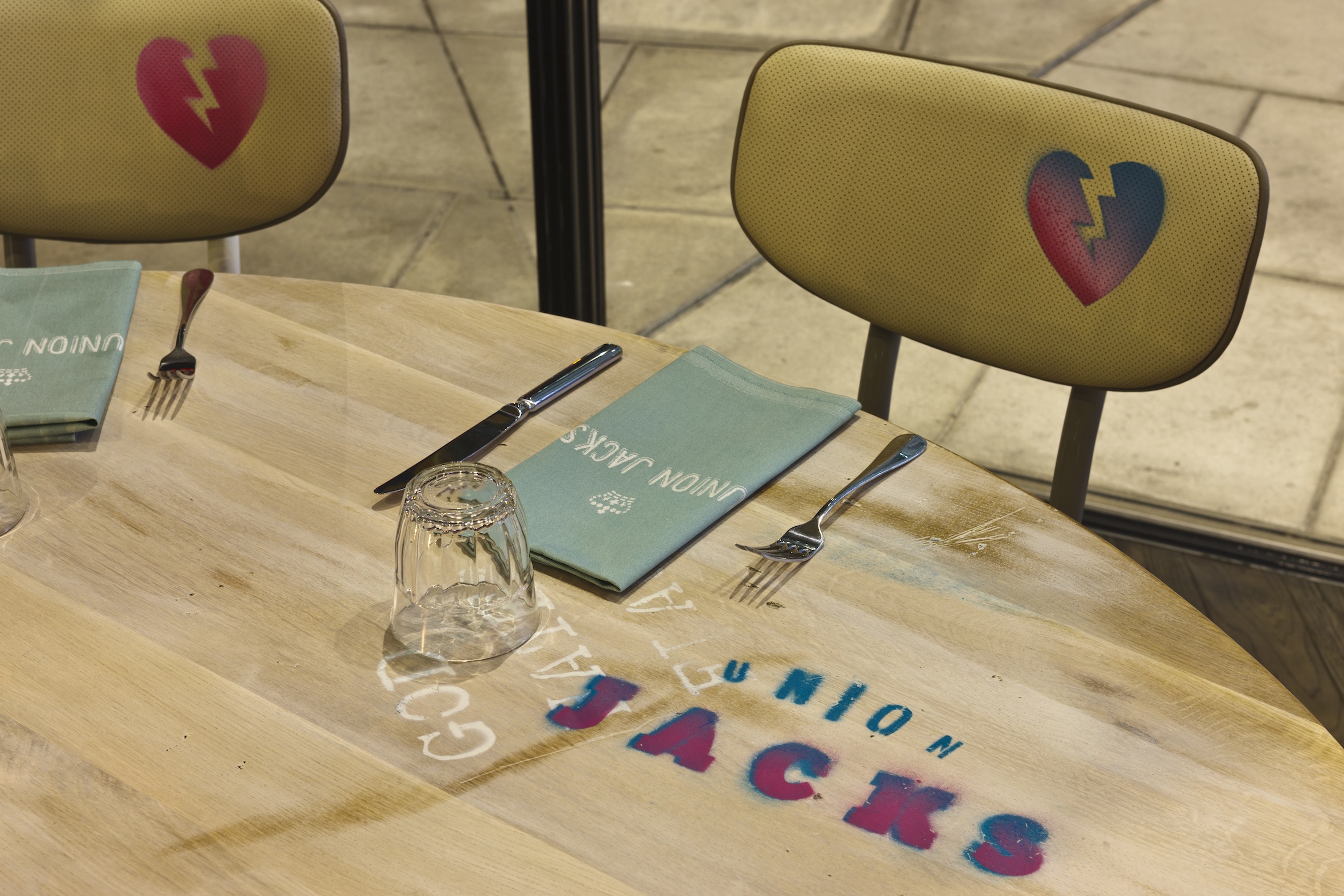
Graph paper is printed on counter tables, stools are reminiscent of a school science lab, while simple ‘wash-top’ wooden tables and chairs with basic metal frames are used elsewhere throughout the restaurant.
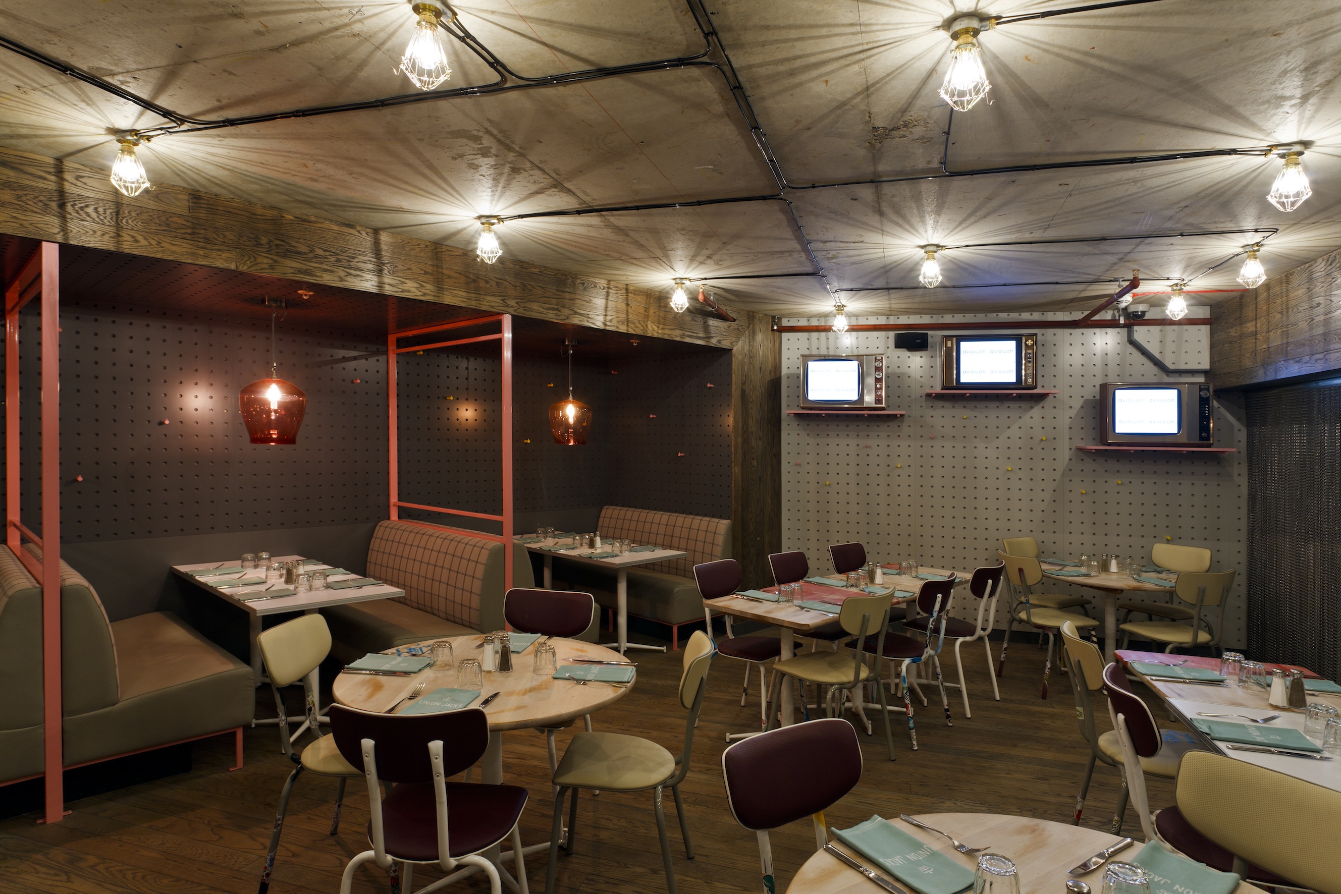
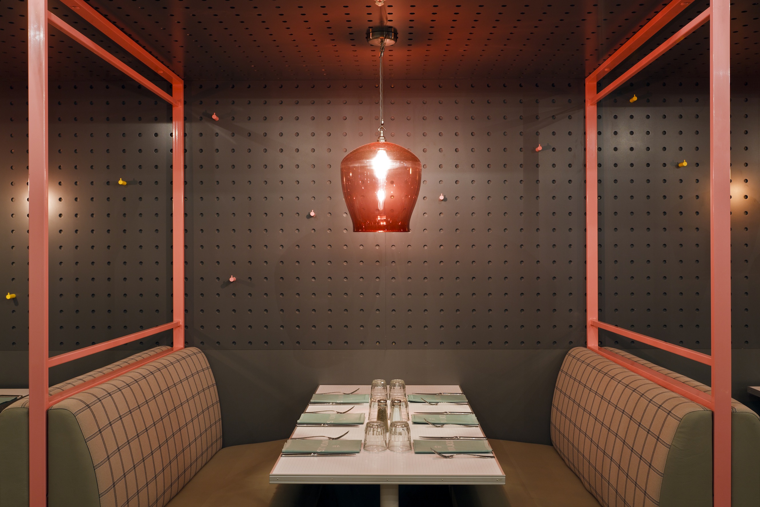
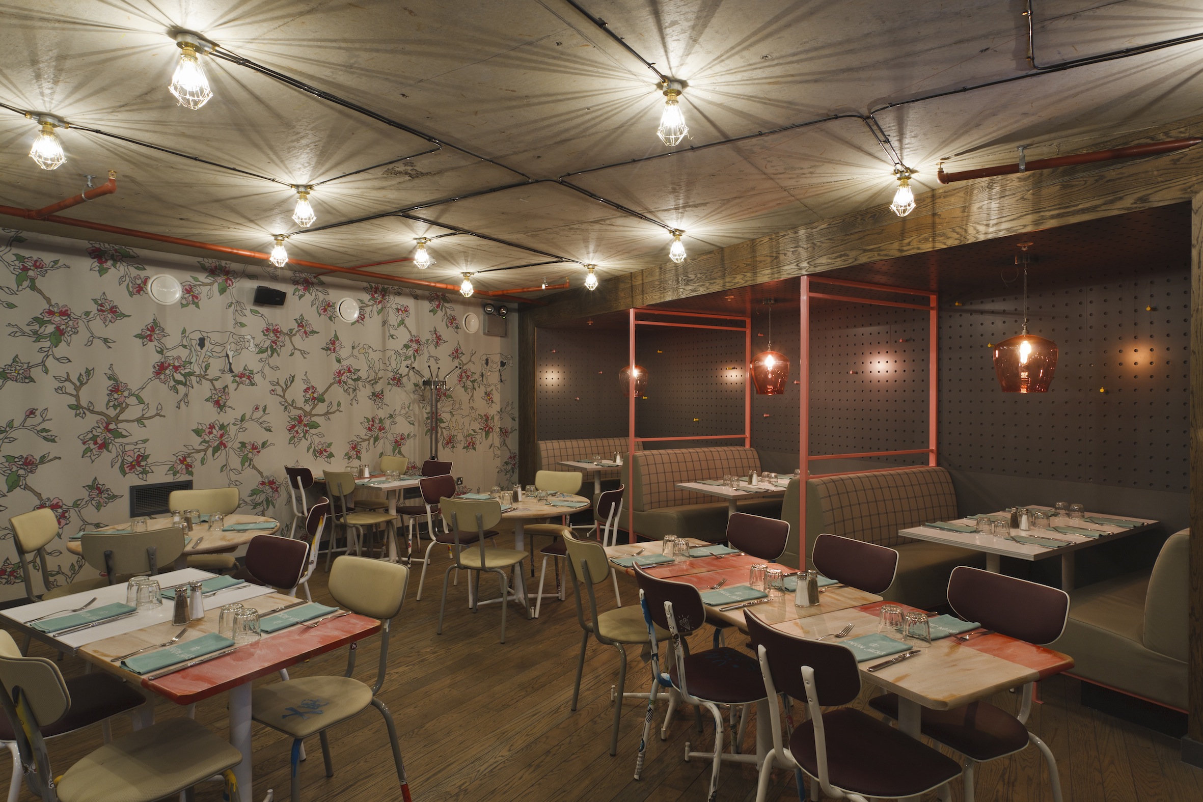
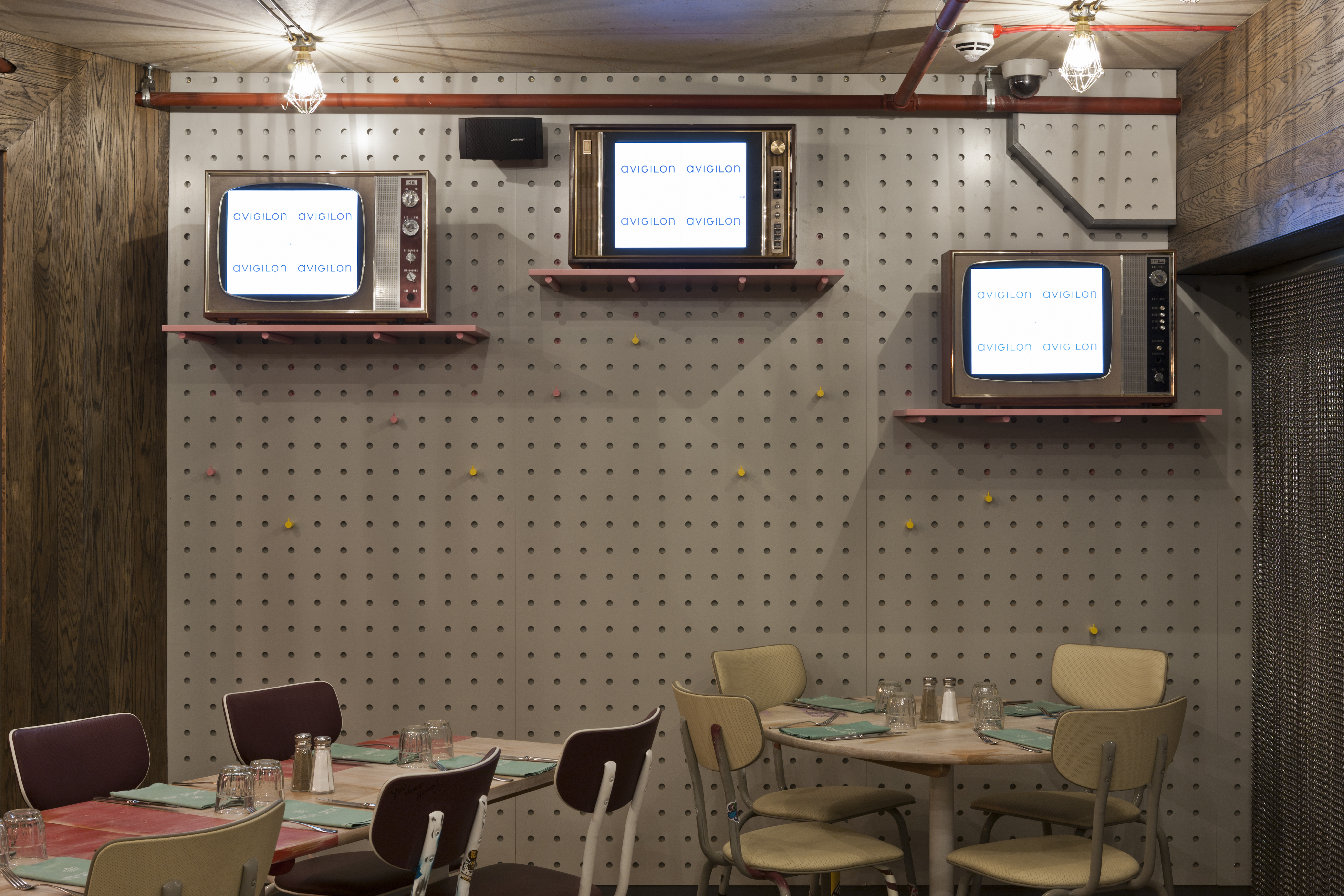
The lower ground floor is an intimate space with tables in booth settings. Antique TV screens are linked to cameras in the kitchen so diners can view the chefs at work. Bold graphics are painted on the walls and the menu uses old-school typewriter font.
Blacksheep’s biggest challenge was working within the existing building that would house the first Union Jacks restaurant. Specific guidelines had to be followed; the glass walls surrounding the space could not be covered so passers-by could see through it completely at any ground level vantage point. Blacksheep’s solution came in the form of a ‘canvas’ of three internal walls built to surround a central lift shaft. These walls were designed to act as a backdrop to working areas, and to house the wood-fired ovens, creating a visual experience for the diner.
The Union Jacks design is the result of Blacksheep rising to Jamie Oliver’s challenge seamlessly integrating his personal values into a functional restaurant space, working around the limitations of an architecturally complex building and creating a memorable dining experience for the great British public.
