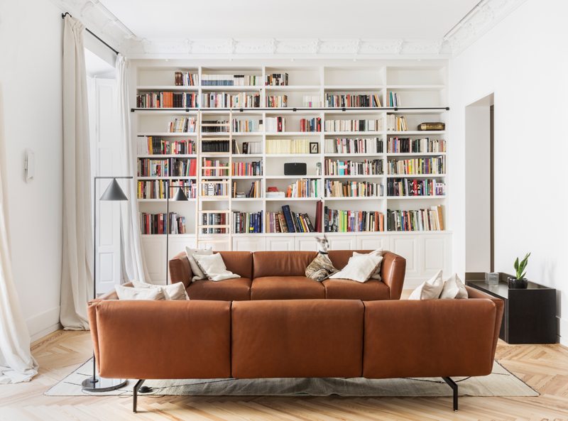
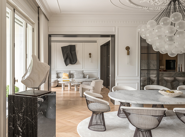
Ventura Estudio cares for the interior of a home that is also a show-room, playing with contrasts in a minimalism-rich personality.This contemporary home, housed in a 19th century historic building, is not just a black and white home. It's a business card. This is how Juan Carlos Fernández and Reyes Castellano, architect and designer, who owned the Venturian studio in Madrid, have experimented and searched for it, a showroom for future clients, an aesthetic manifesto to whom to entrust their vision.
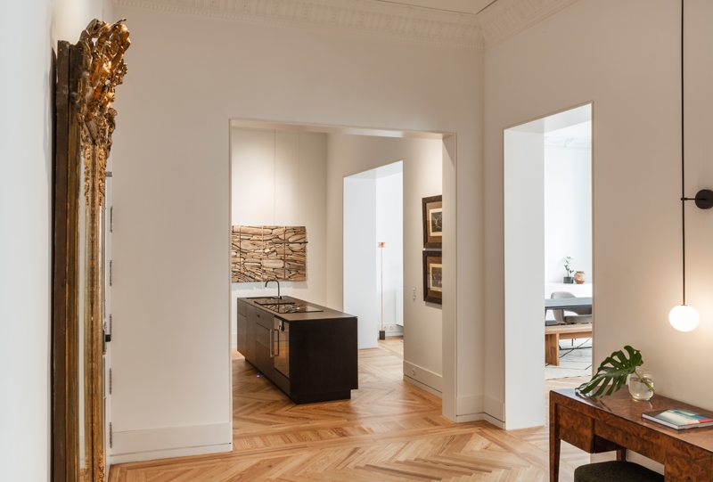
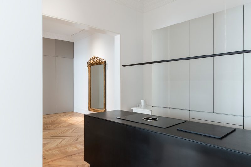
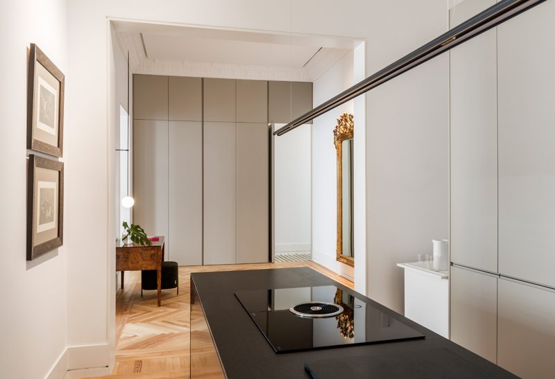
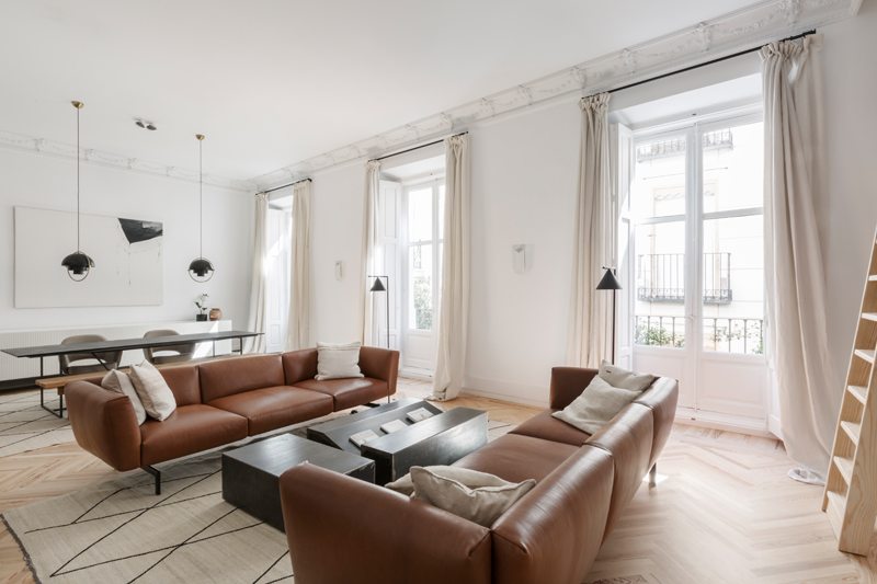
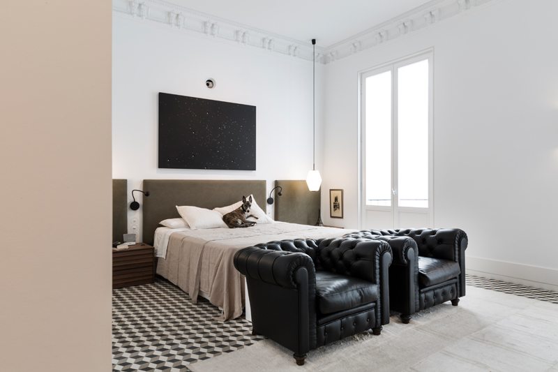
That's why his name is Venturalab. It turns out that one of the two in this modern home really lives. And then the cure with which each object is drawn and harmonized with space becomes a personal matter. The spirit that guides the stylistic choices is characterized by the balance of contrasts: pre-existing architectural elements retain their classic charm but are revitalized from a modern approach, which prefers pure lines and minimal solutions. White and black are the primary colors that face a dichotomy that is sweetened by the extensive use of bronze and leather. To warm up the environment first of all, the wooden floors, alternating with tiles from the traditional allure. White walls are the backdrop to modern and functional design furniture.
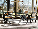
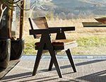
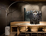
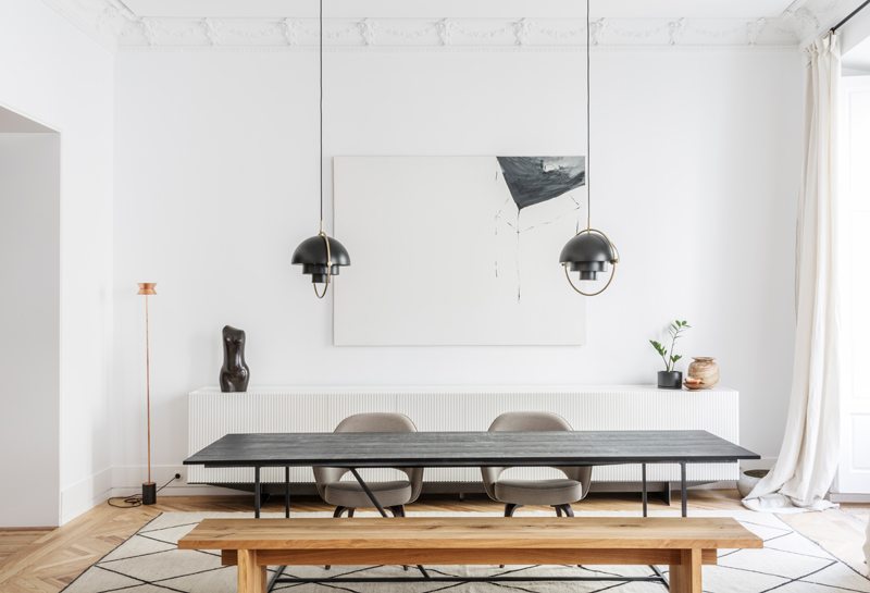
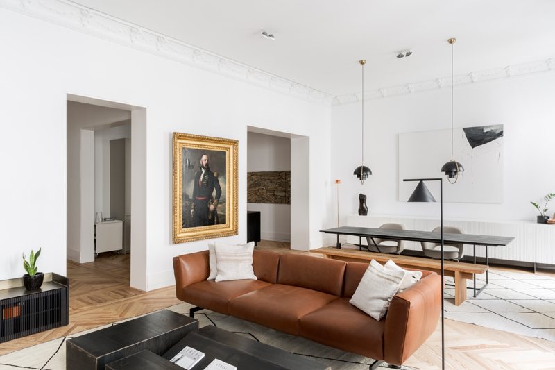
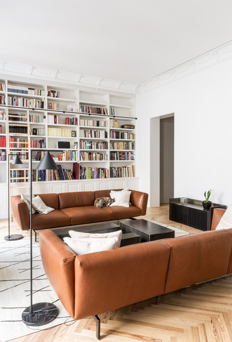
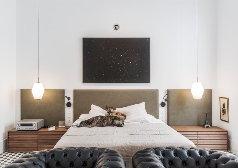
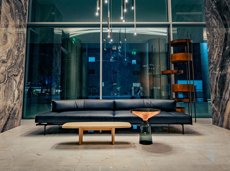
In the kitchen and in the living area, the heavy and square lines of dark wood tables and shelves are mitigated by the soft contours of leather sofas and seats, aligned in space with a rigorous and clean rhythm. The same thing happens in the double bedroom, where two sturdy black armchairs seem to be the natural continuation of the bed. To be a jumble between the essence of black and white design and the antique soul of the palace are intentionally emphasized details such as the portrait in the living room and the mirror in the hallway, which with their sumptuous golden frames claim a central role in space. Golden Accents also feature lamps, extravagant appearance and character that help to ease the austerity of the set.
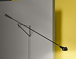
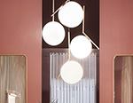
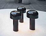
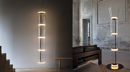
There are scandinavian, steel and brass sculptures in their long, tapered stems combined with curved volumes, and then there are the ad hoc lamps designed by Ventura Estudio, enamelled metal that resembles the pattern of tiles: these ultimately synthesize the style of the Spanish duo, simple and sophisticated together, with an artistic twist that takes away the monotony.
