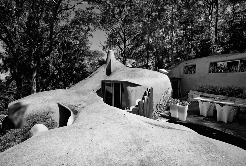
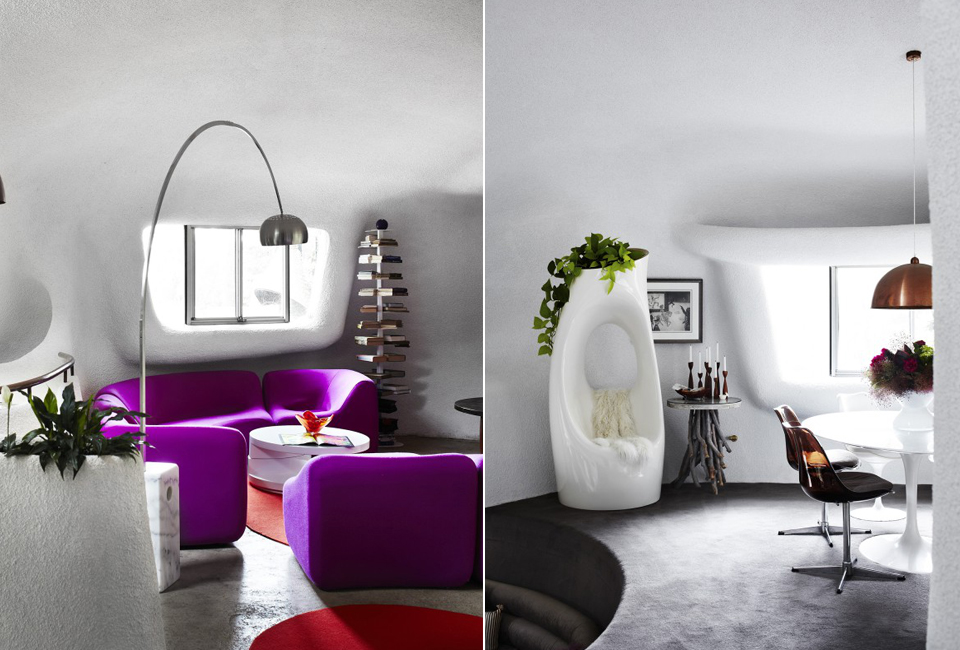
The Hollander House, built in the late ’60s by architect David Hollander, is an icon of Australian organic architecture. The adventure of arriving at Hollander House begins with the drama of Grandview Drive and an arrival under the architect’s shell-roofed garage supported by three hand-formed ferro-cement columns that immediately evoke memories of the Antonio Gaudi’s Barcelona architecture. The surprises continue with the rounded corners of the asymmetrical front door and the lobular timber panels of an adjacent gateway.
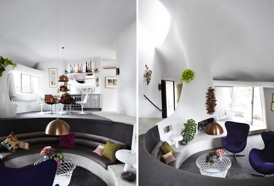
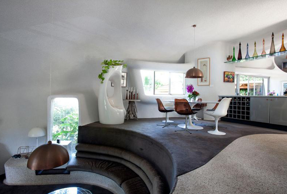
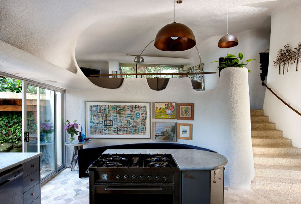
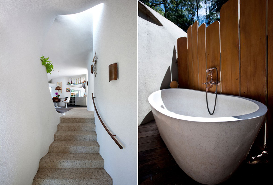
Inside, Hollander’s interior architecture continues this adventuresome exploration of the site’s potential by following the site’s slope through a terrain-embracing floorplan. While each zone of living space is universally functional and efficient; the materials, the internal spaces, and their individual views into surrounding bushland are calibrated to the setting. Using the definition popularised by the American architect, Frank Lloyd Wright, it fulfils all of the criteria of an ‘organic’ house developed specifically for the site.
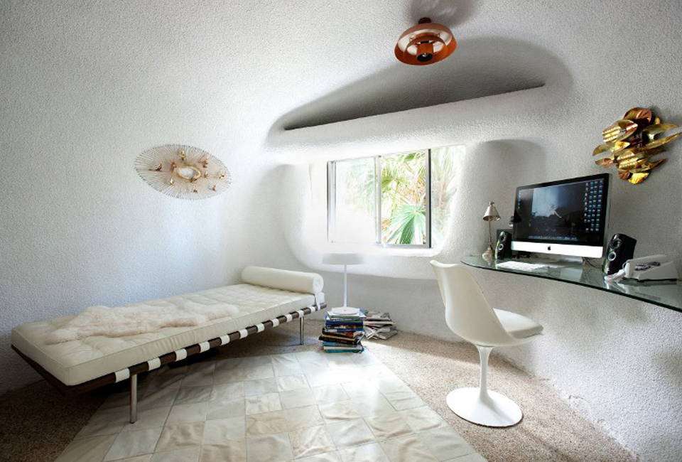
The architect’s ambitious exploration of elliptical geometry working in the medium of steel-reinforced cement is a near-ideal fusion of medium and architectural intent. The interiors and exteriors are carefully calibrated to create a building that grows out of the site. As Frank Lloyd Wright said of organic architecture, “No house should ever be on a hill or on anything. It should be of the hill.” Hollander’s house at 81 Grandview Drive fulfils that criterion.
“I’m still convinced that poured concrete will be a viable, economical alternative material in domestic architecture“, said once David Hollander.
“I chose curves which I thought were correct aesthetically”. His multiple levels have been carefully displaced to allow internal long views and vistas.
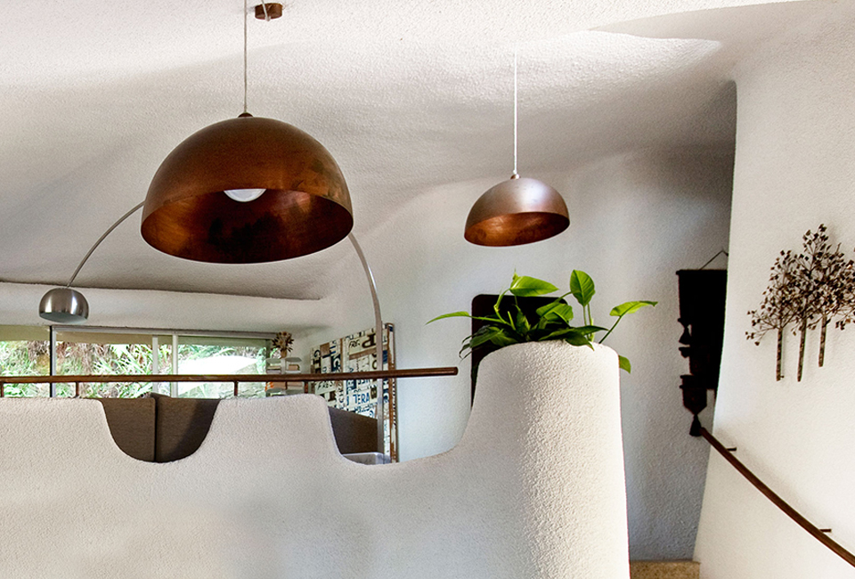
The current owner, a professional interior designer, has kept the faith with Hollander’s vision and worked assiduously to recover elements of the original design. “I found a 1972 magazine article on the house,” she recently told an interviewer and “that allowed me to see what it originally looked like.” The interior designer also revived the architect’s original lighting plan keeping the patinated copper fixtures and adding new elements in the same scale and material.
