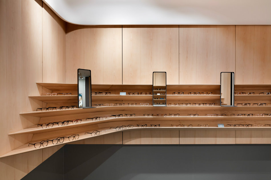
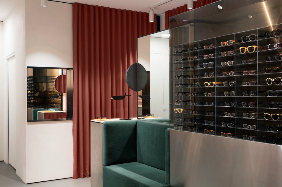
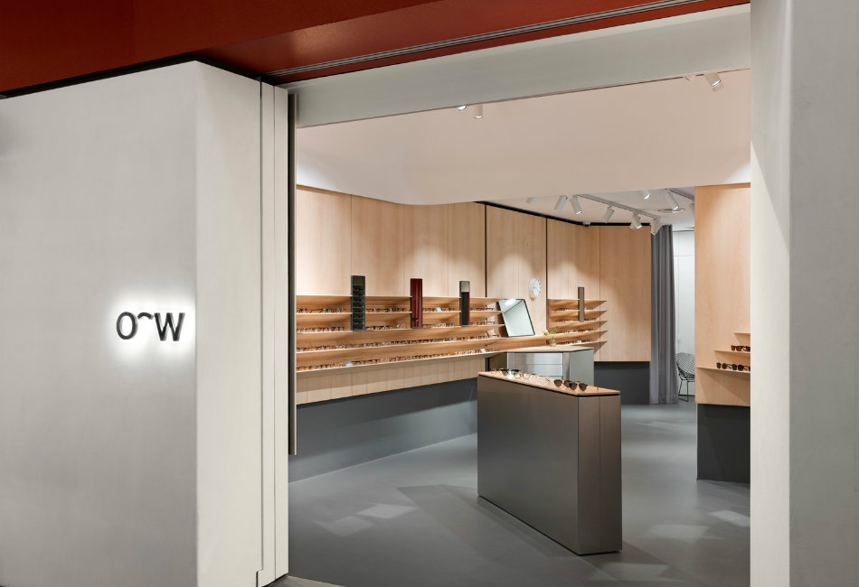
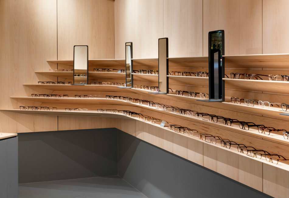
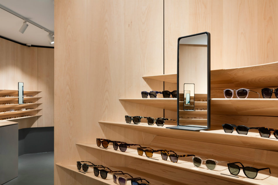
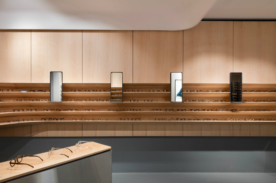
Sydney-based eyewear company Oscar Wylee has recently opened their first Melbourne store, designed by the local architecture & interior design practice DesignOffice. The store’s architecture reflects Oscar Wylee’s design traditions: the timeless and enduring values behind their frame design, delivering a space of calm respite required for selecting eyewear and conducting eye-exams. When asked about their inspiration for the project, the team at DesignOffice explain: “The design response is anchored in an understanding of the Oscar Wylee brand, their eyewear, and the way you shop it. They are a brand with a very focused attention to detail, embodying a confident sense of simplicity yet something of an effortless and warm personality.
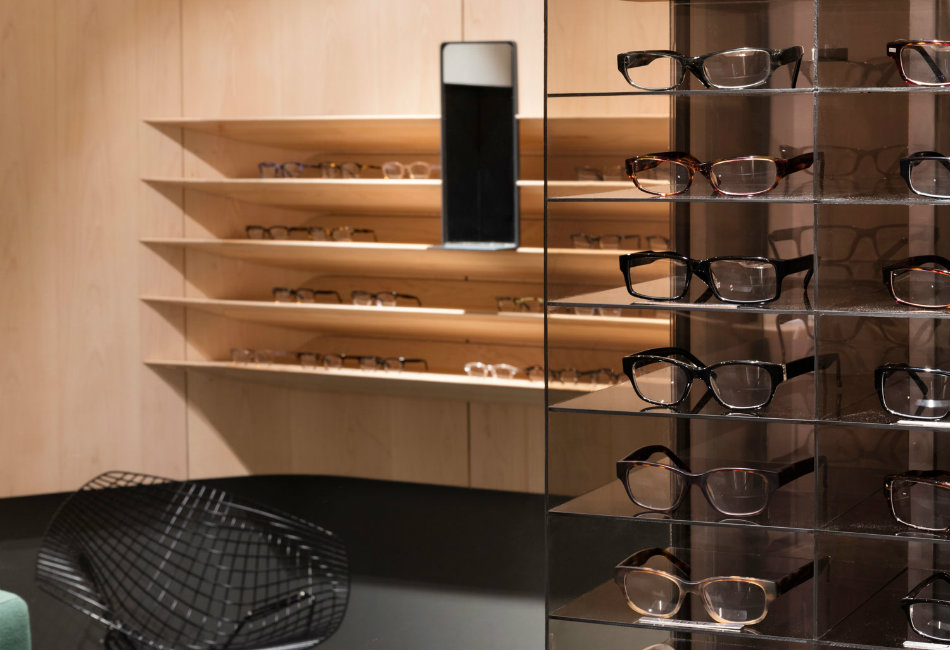
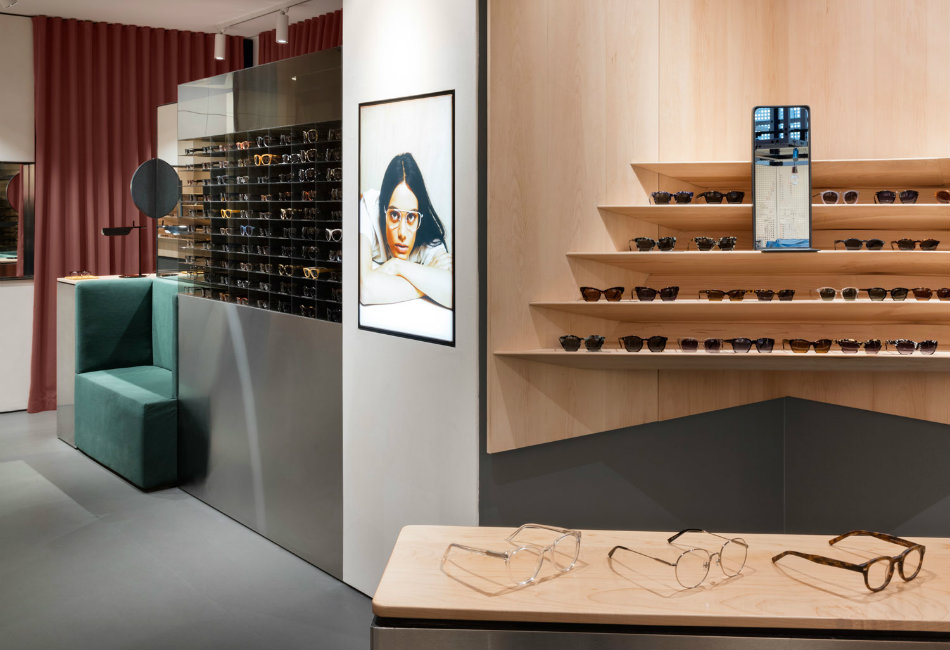
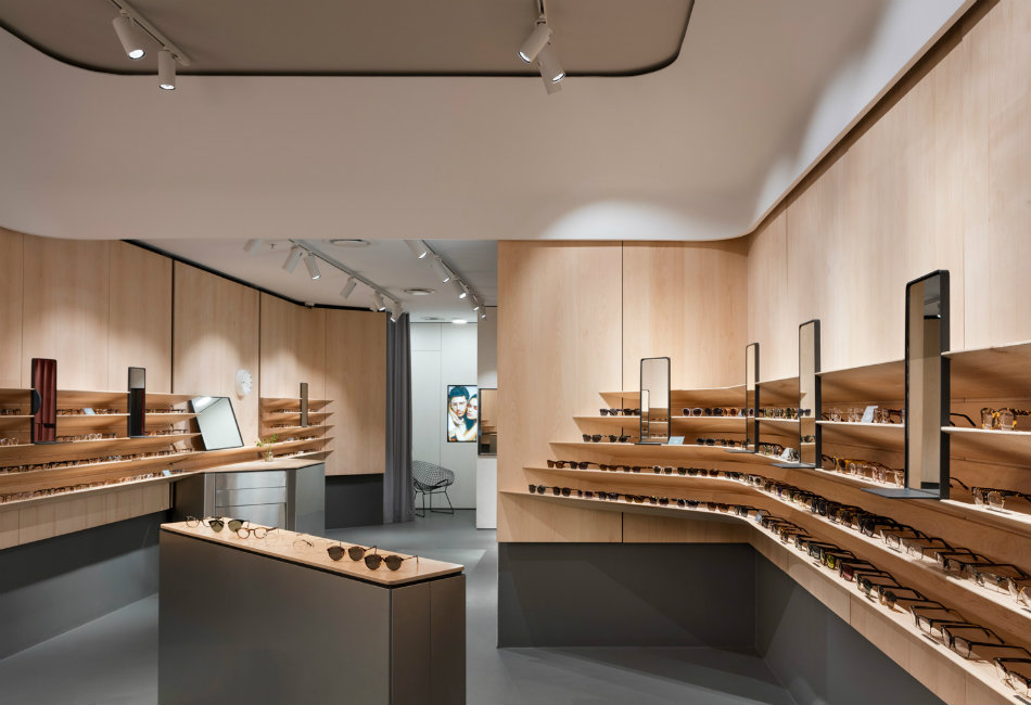
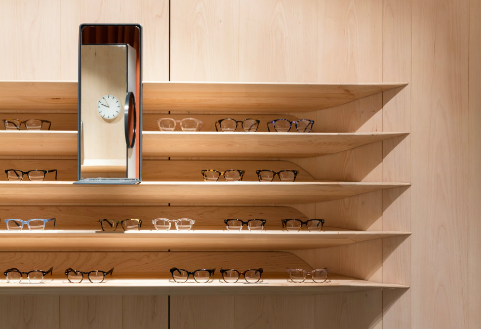
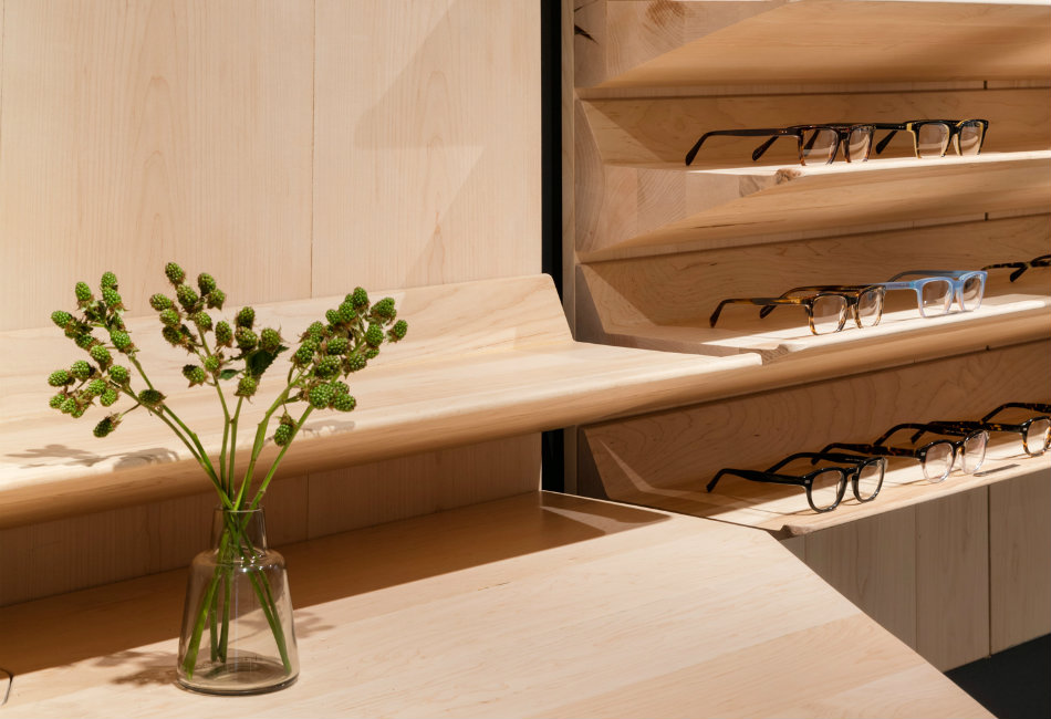
For us this translated into the creation of a space which, on the one hand, is very clean and simple, yet is also layered with colour, depth and crafted details. The nuance of the timber shelving design and subtle layering of domesticity provide an immediate and tactile connection between the customer and the product.” The compact store is expressed as a pair of adjacent rooms, lined with a gently curved custom solid timber display system. Walls are wrapped in maple timber floating above a base of mid-grey rubber. Stainless steel and white plaster complete the core palette balanced with injections of olive green, cobalt blue, and terracotta.
