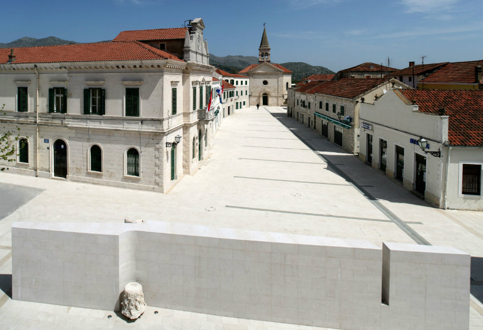
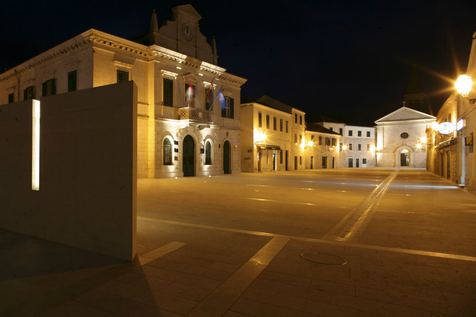
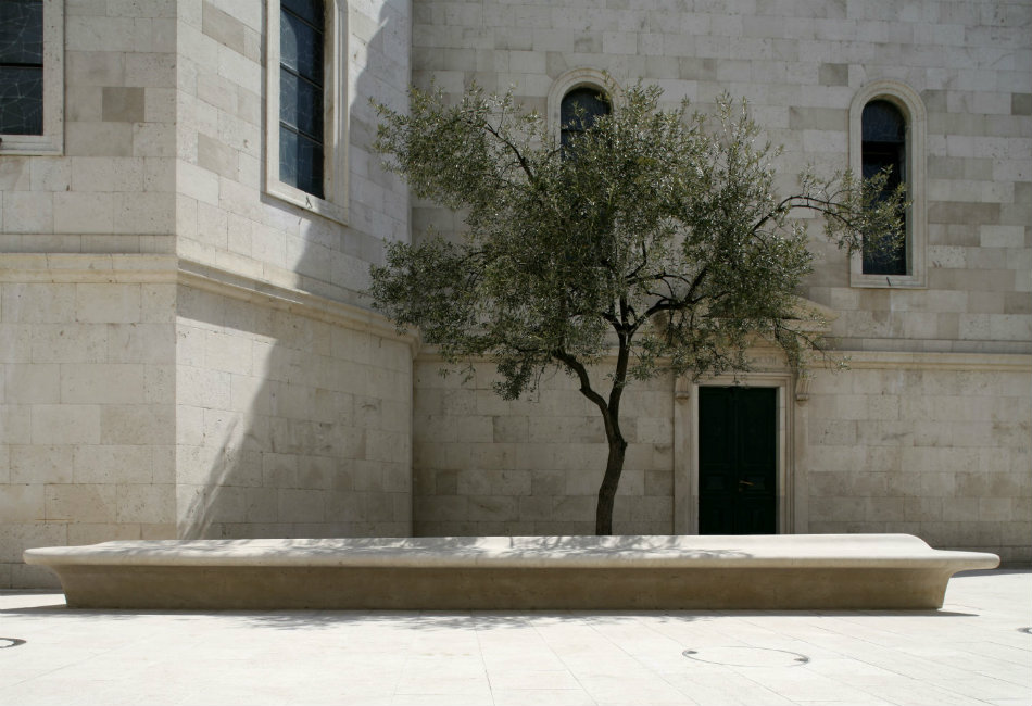
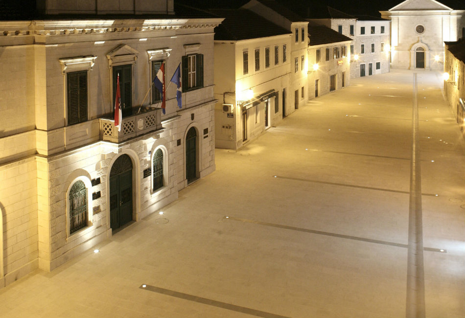
Spaces and buildings with a public purpose create the most noticeable and distinctive majority of the world's archaeological corpus. And the maintenance level of public spaces is still a relevant indicator of a society's civilization level. The moment which ought to have been taken into consideration during the design process was certainly awareness of the historical significance of this region. Nevertheless, the greatest importance this region attained was in Roman times, when the Narona settlement (in the vicinity of today's Opuzen) obtained the status of colonia. For the everyday life of a Mediterranean town, the central square/piazza is the salon, the living room of the community, and in this sense Opuzen's piazza particularly stands out among Dalmatian squares. Especially surprising is its size in relation to the size of the town itself. Before melioration of the river Neretva in 1885, of which an obelisk in a park by the river reminds us, this small town had many river tributaries and canals and therefore the piazza was the only place where it was possible to walk freely. The melioration was carried out during Austrian rule, when quays were built on the Neretva and the Mala Neretva, and around 1900 two most important buildings were also built on the piazza – the municipal building and St. Stephen's Church, both in historicistic, neo-Renaissance style.
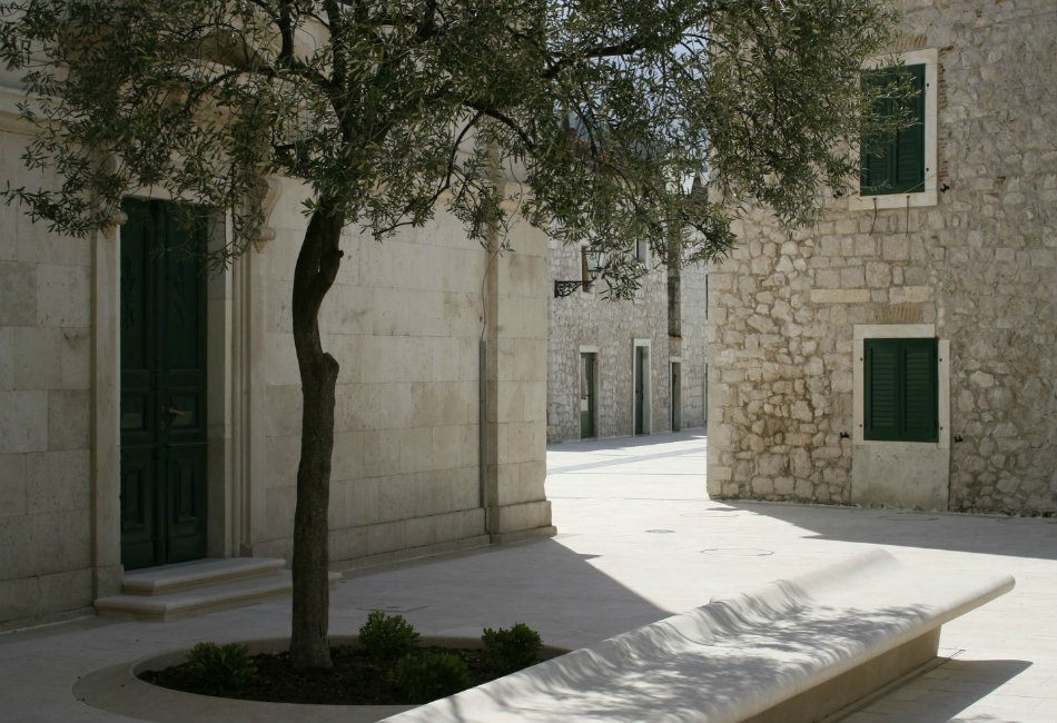
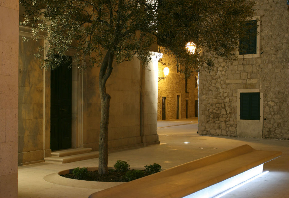
Opuzen's piazza, like a true Mediterranean piazza, is a stage for everyday rituals. Which is how the architect approached the transformation of this lively urban organism – so that almost all traditional flows were retained... as well as the manner of using public areas. The architect's intention was: to enable the revealing of its qualities' and to remove 'formative disadvantages by introducing spatial and content-related correctors'. The method which the architect used to achieve this suggests a continuity of his opus, since some solutions remind one of the methods applied in Pag and Umag. The need to restore the decrepit infrastructure led to the idea of renovation and a new square design.
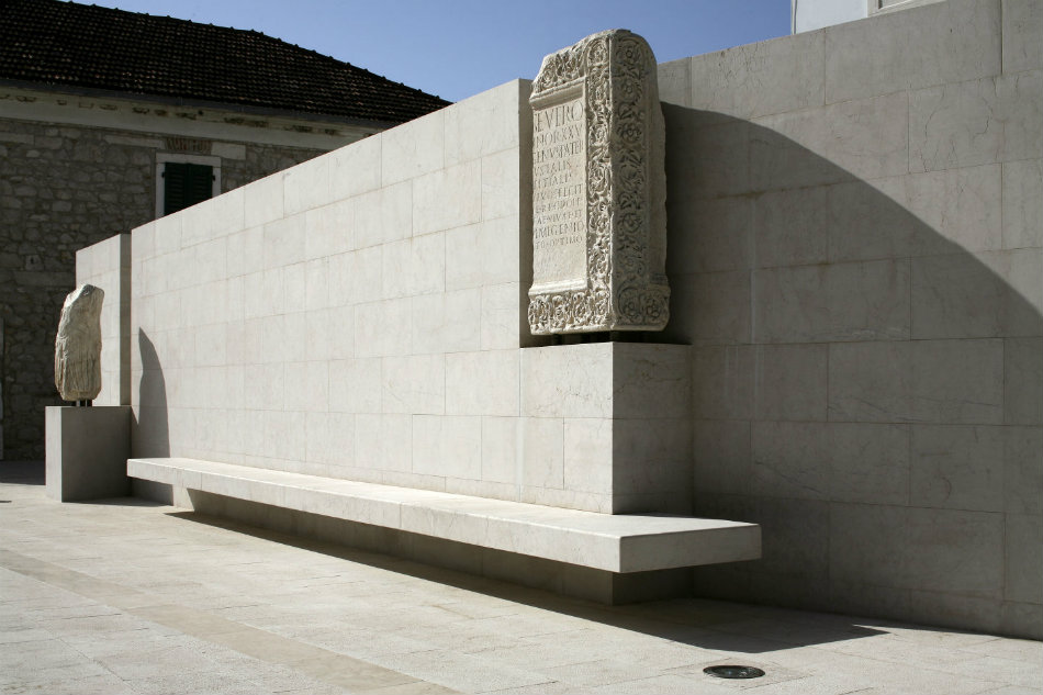
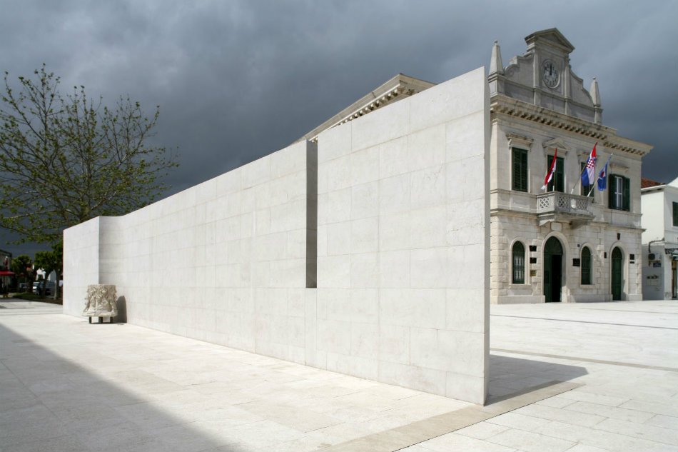
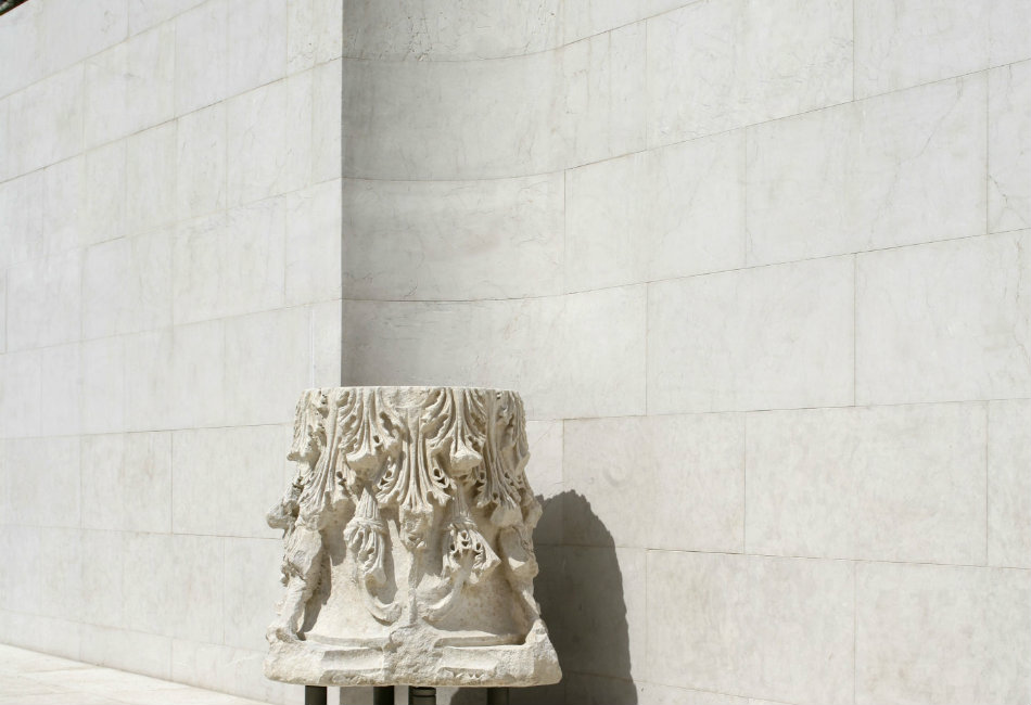
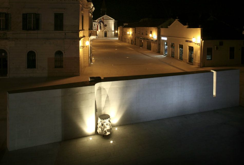
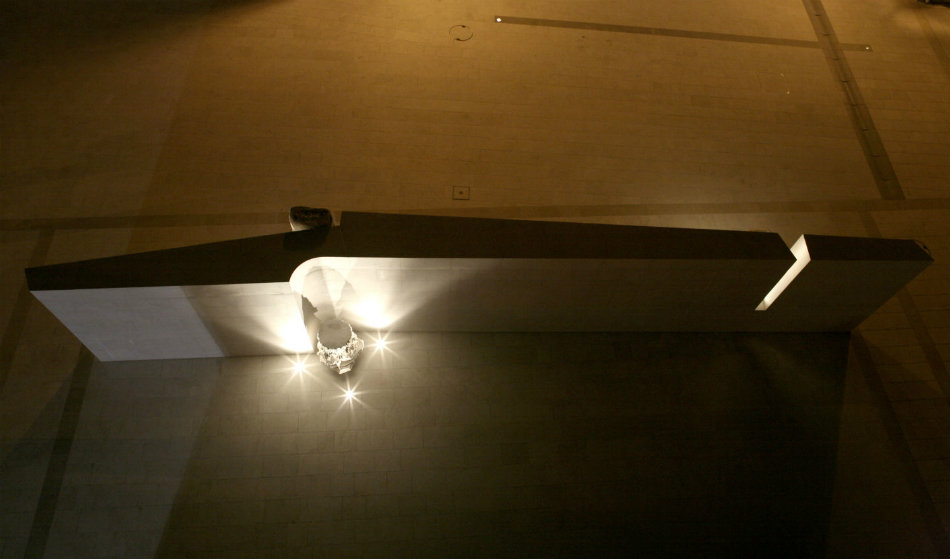
The remnants of Roman palaces and monuments were frequently built into the walls of village houses in this region but still, many valuable monuments were preserved. The presentation of Roman artifacts as identification factors became a leitmotif of the new design. A white stone wall, with protrusions, a slit and a curved segment, was built for presentation of the stone monuments. In this place, the torso of Tiberius hovers over a base slanted in perspective; the Corinthian capital found its place in a curved wall niche, turned upside down so that the testimony about donor Anđelo Vidović can be read. This wall – at the same time divider and corrector of space. During the 70s, a bank building was built on the square, on the opposite side to the church. The building was entirely inappropriate to its surroundings by its outlines and proportions, and what's more, was decorated with rather inelegant stone elements. The wall does not hide it, yet it reduces disharmony and pretty vulgar dichotomy: bank – church. The wall with the stone elements is an introductory or final accord of a composition which does not have 'too many notes', but rather 'exactly as many as necessary'.
