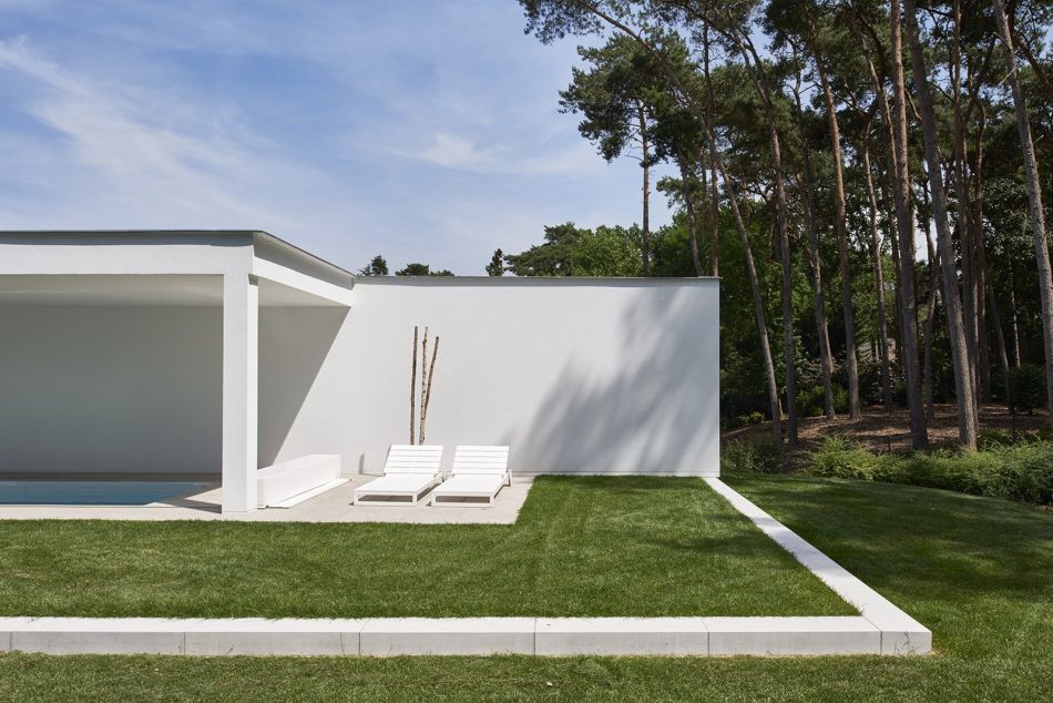
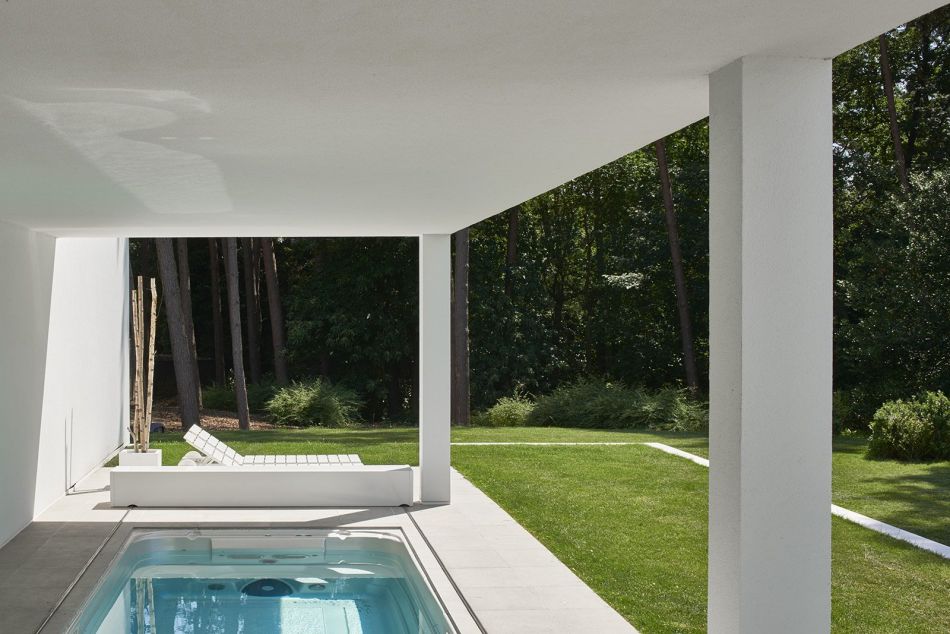
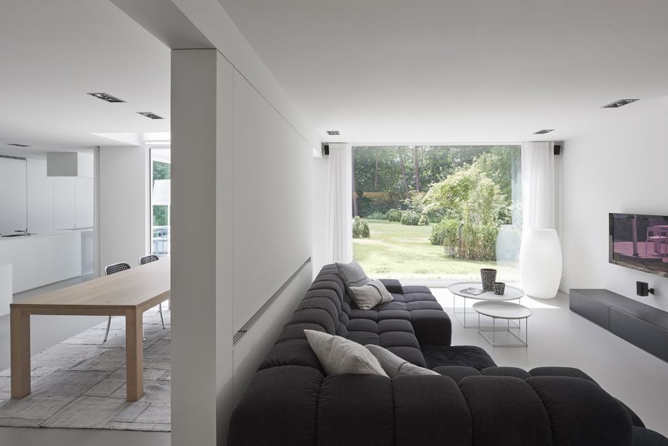
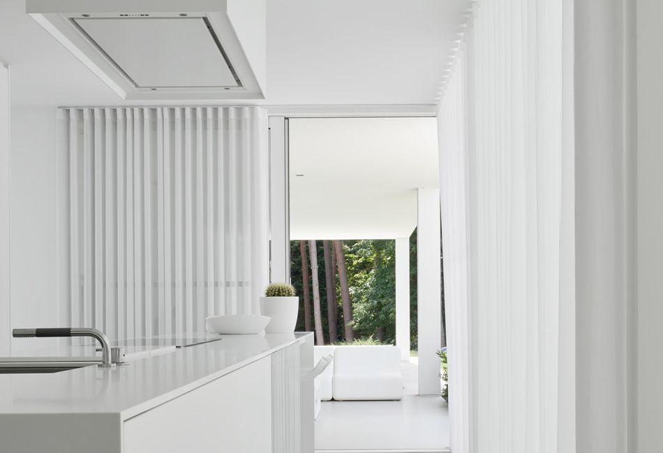
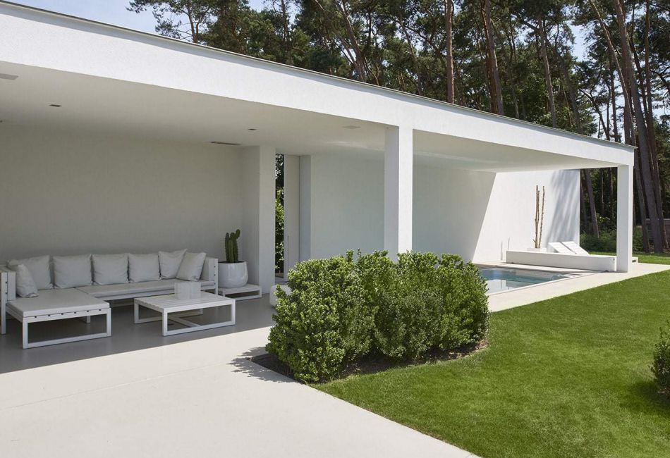
Simple colours and basic geometries define Keerbergen House. White is favoured, as is a single-story rectangular floor plan. The ground floor is spilt in two parts: a kitchen on one half of the space and a sitting room on the other. Rather than separated to two different rooms, a divider wall spans partially between them. Floor to ceiling windows stretch the full length of the house, highlighting the home’s wooded surroundings.
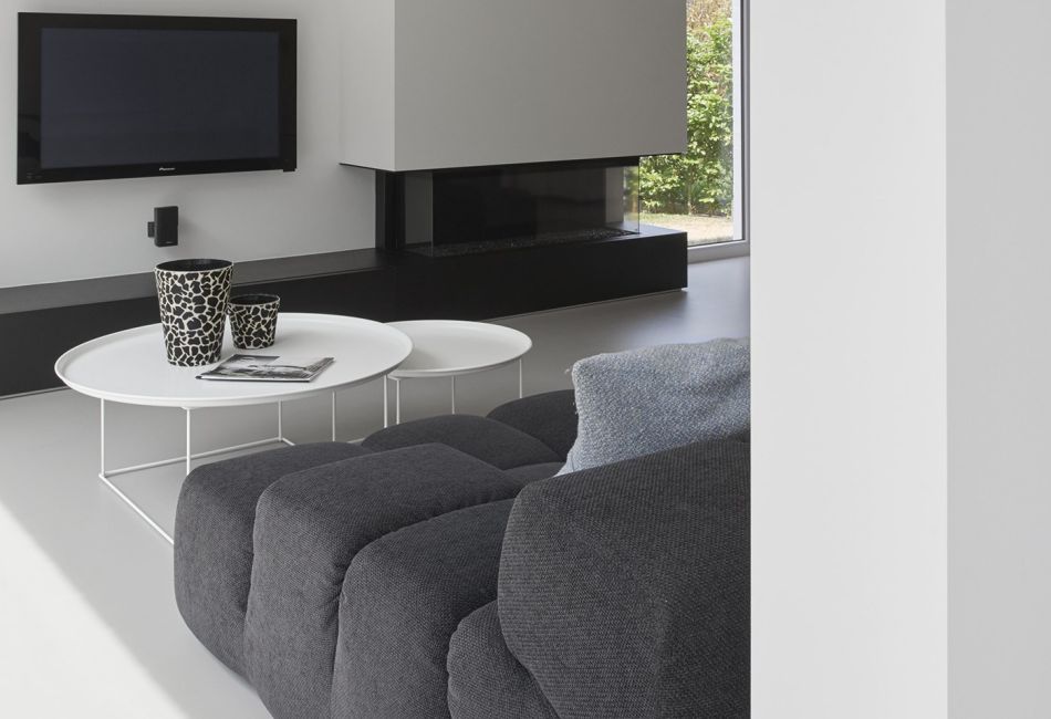
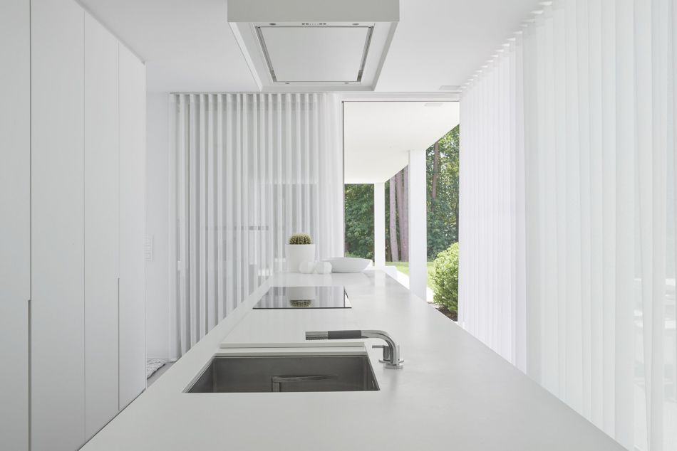
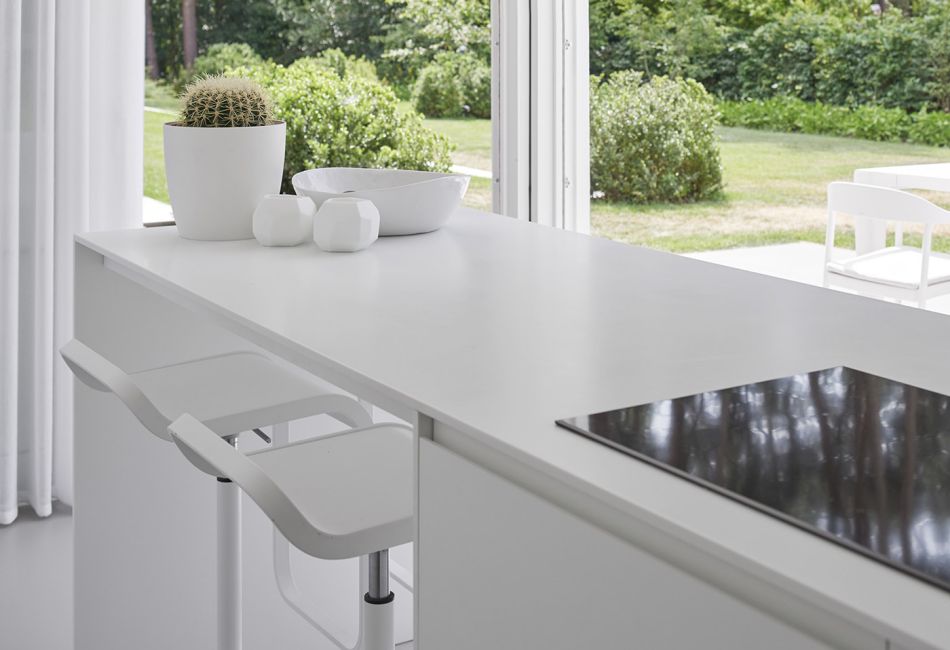
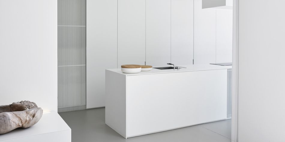
The kitchen follows the all white colour scheme with tucked-in storage and low profile workspaces. Rather than looking utilitarian like many kitchens, the kitchen in this home reads more like an art gallery. Combined with the gorgeous views behind the island, this kitchen is easily one of the best minimalist kitchens. In the living room, an oversized white couch is a statement choice. This piece of lounge furniture provides an inviting warmth to the room. A long centre console, in a dark colour matching the couch, defines the sitting area and provides an unobtrusive home for a sleek fireplace and TV. Minimal doesn’t have to be stark—this living room is as comfortable as any.
With Keerbergen House, Minus has achieved a kind of accessible design that can be tricky to master in minimalist interiors. It is not hard to envision a family stretched across the sofa watching TV, eating and cooking in the kitchen, or playing in the backyard. Often designs balance use and style, but Keerbergen House is more of a combination. Every detail has a purpose fully integrated with its aesthetic value. This interior design is truly admirable.
