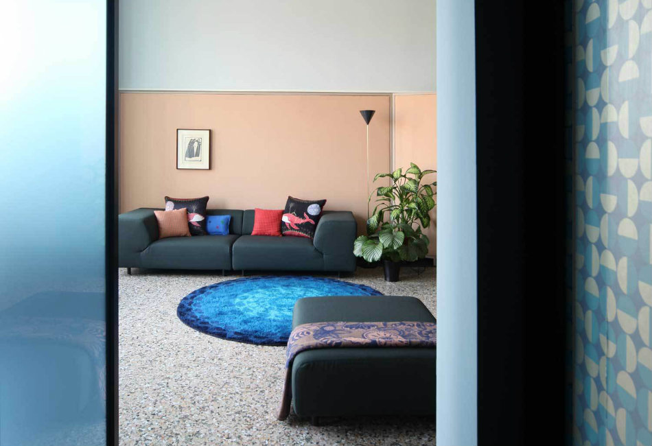
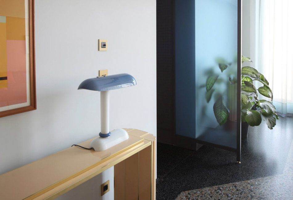
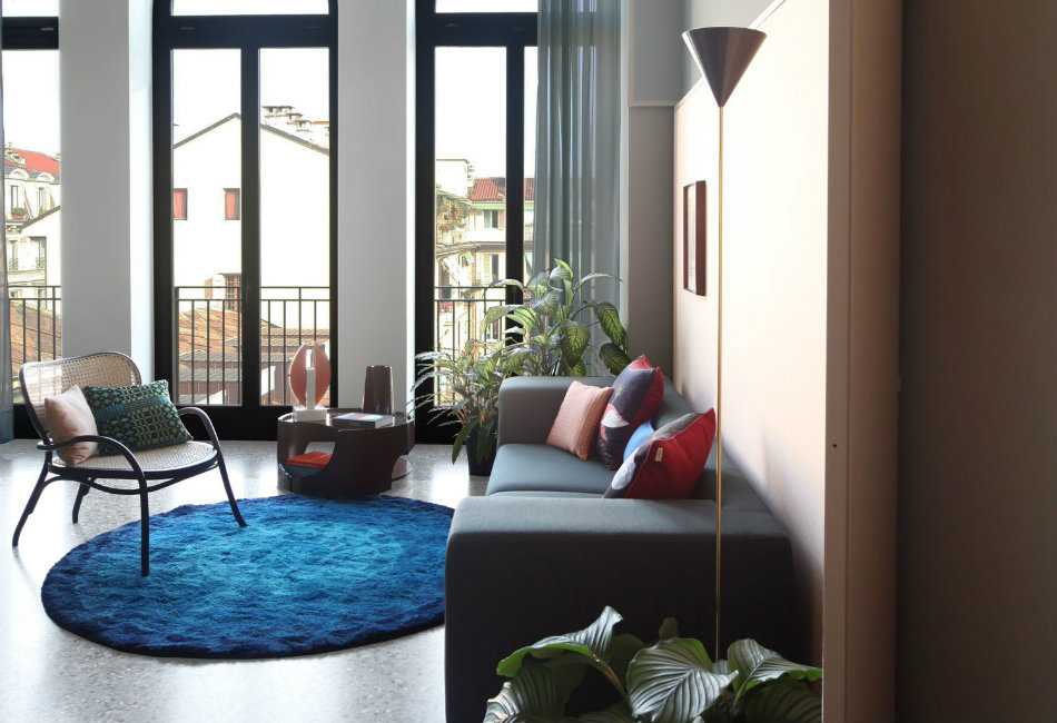
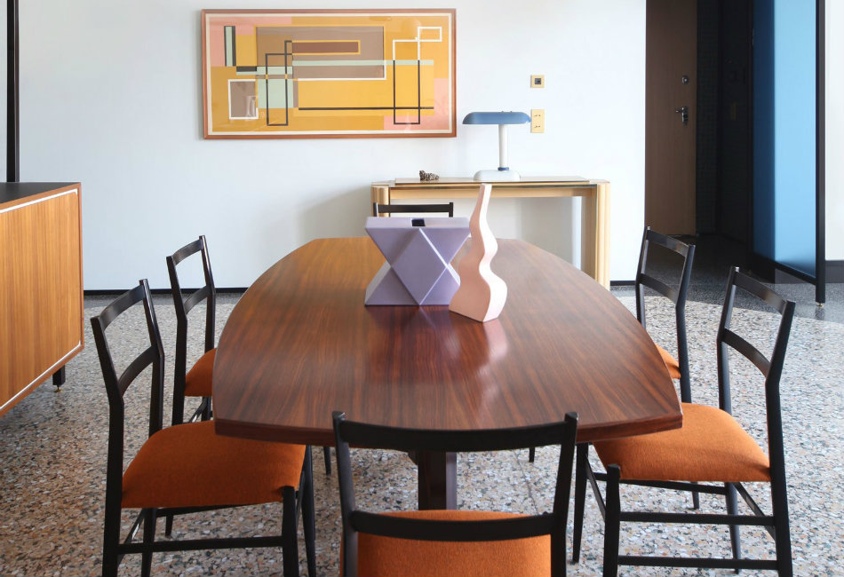
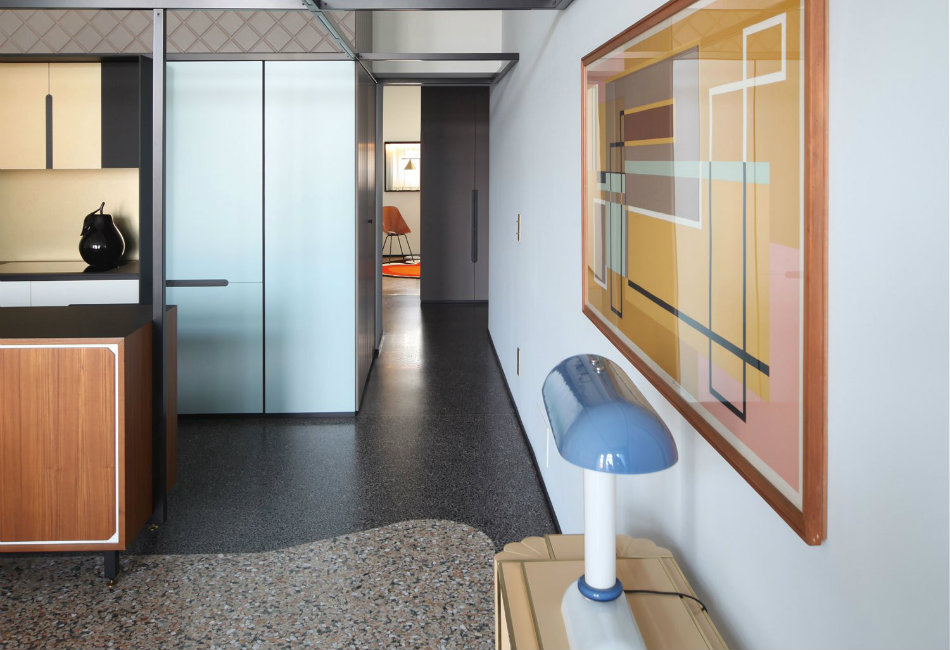
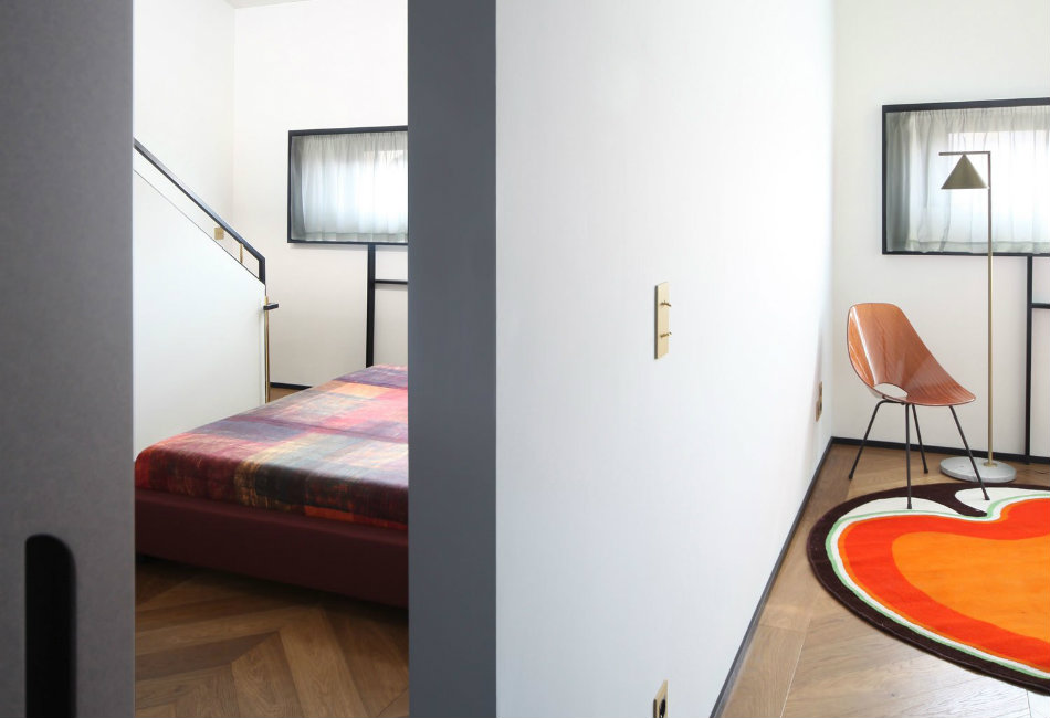
It’s hard to fathom that within a traditional 19th century building in Turin, Italy lies a delightfully quirky apartment that’s bursting with character. Faced with a rather soulless interior, Andrea Mercante and Adelaide Testa (previously UdA Architetti) sought to not only renovate the space but construct a vibrant new identity. According to the architects, their intention was to “rewrite a story in a delicate balance of citations from the past.” We’ve featured Marcante-Testa (UdA) a lot on here and for very good reason – there’s a captivating playfulness in their approach to design that leaves you puzzled yet totally intrigued. The 160sqm apartment feels bright, open and spacious.
The layout was largely guided by the existing structure of the building where small sized street-facing windows and the different heights of the rooms suggested a reversal of the traditional functional layout. The bedrooms and bathrooms have been shifted towards the main facade while the living room and kitchen overlook the tree-lined courtyard where local building regulations permitted the enlargement of windows to make glass doors.
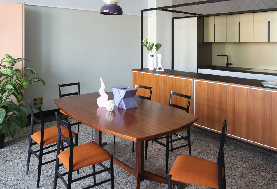
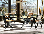
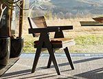
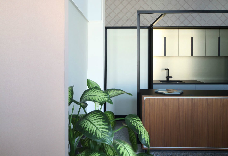
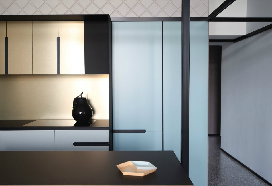
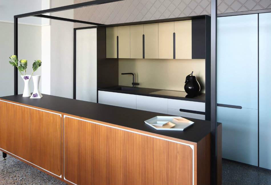
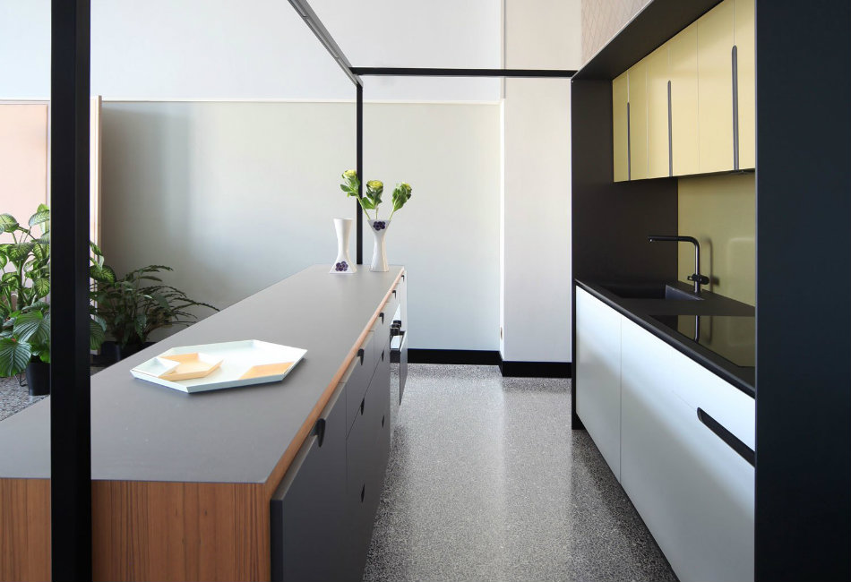
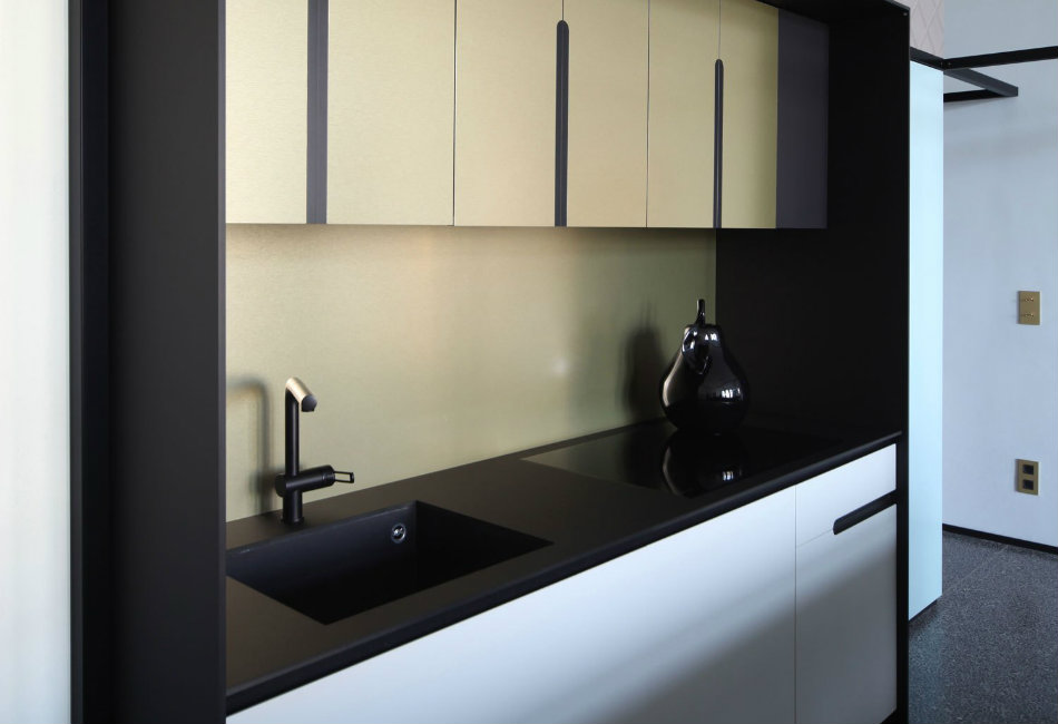
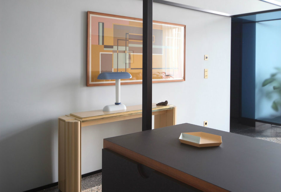
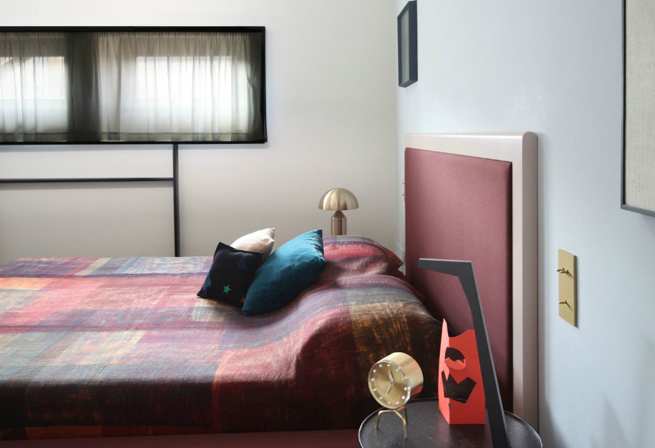
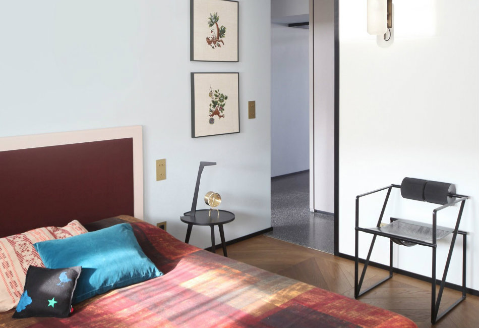
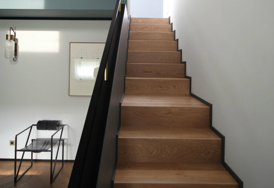
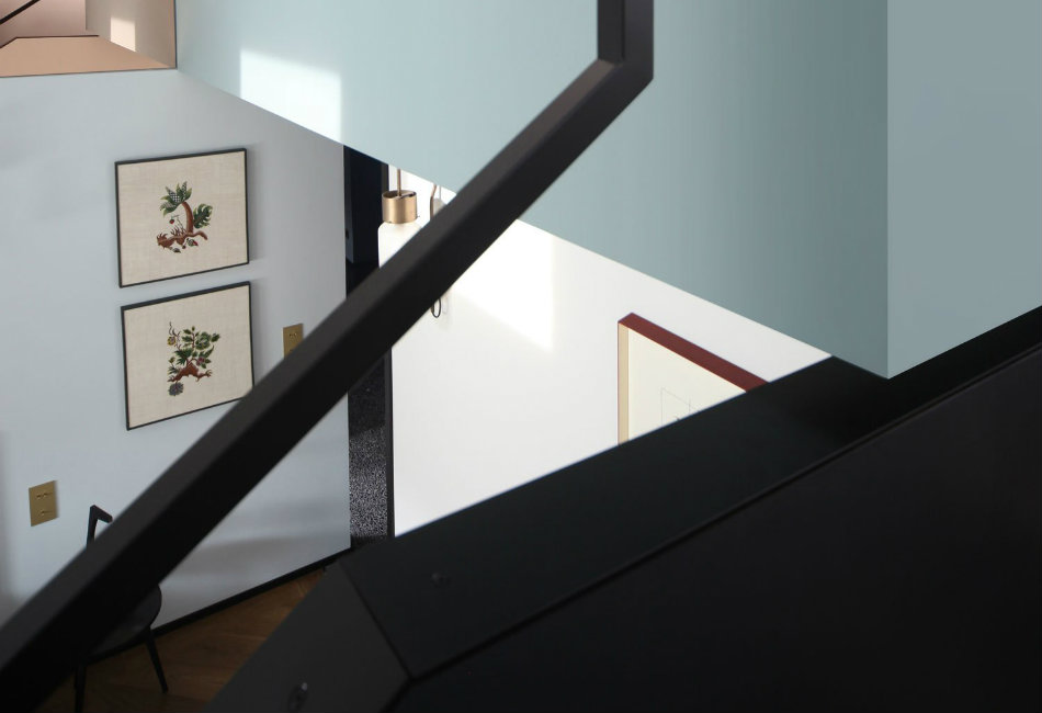
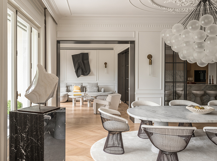
The apartment is comprised of finely detailed custom joinery made from an array of eccentric materials. The kitchen is comprised of teak wood, metallic structure, brass laminate and lacquered wood cabinets. Entirely designed by Marcante-Testa, they note that the kitchen “has an unabashed contemporary look, relying on textures and materials that accompany existing furnishings like the table and chairs already owned by the clients.” Ok, we need to talk about the floor because I have mega-extreme love for this terrazzo flooring. The contrasting colours of the seminato or sown floor guides you through the apartment highlighting different furnishings and areas of activity. Another guiding element is the system of black metal frames that run throughout the apartment. These breakup the vertical volumes, support the lighting fixtures and generate axes of light. These frames echo the strong lines in the bathroom of Minoletti’s Aracadia Gardens in Milan.
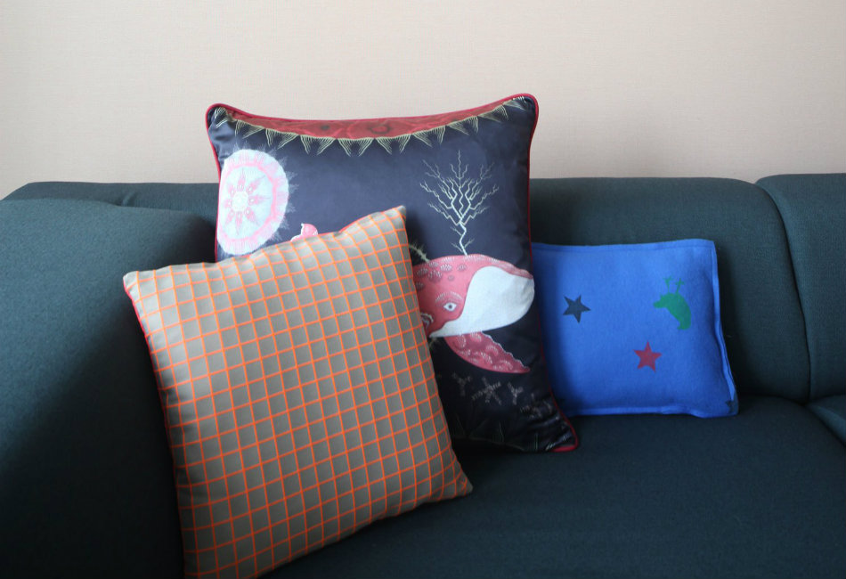
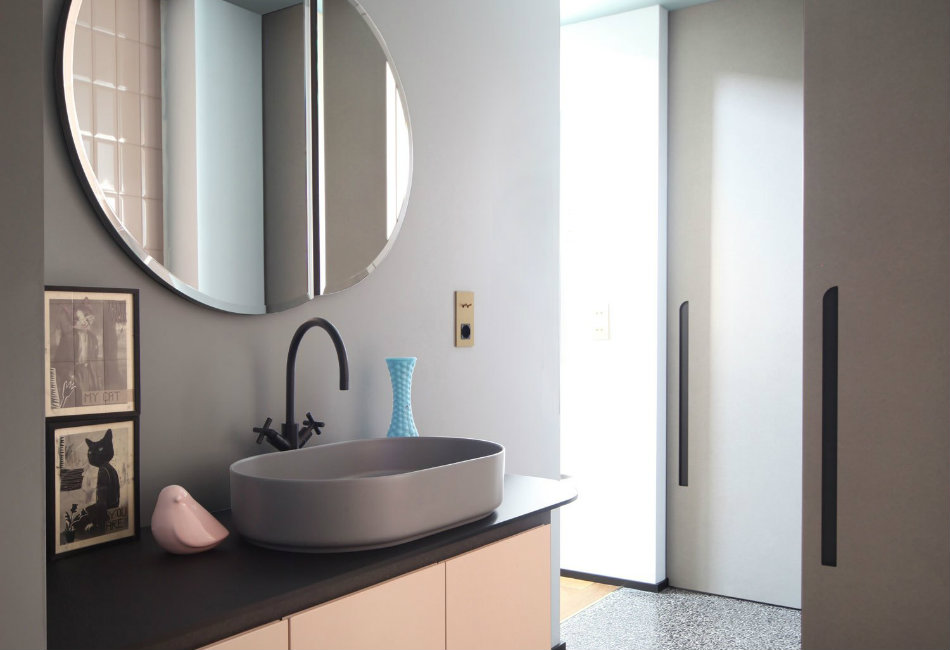
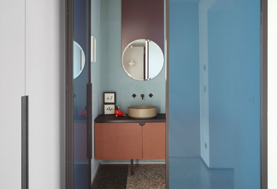
The use of colour in this project is bold, a little incongruous and somehow works. The accent colours tend to be black or bold oranges against a sea of pale pastel tones. I still can’t get enough of that dusk pink and pale blue! The bathrooms illuminate this contrast of colours with the pink lacquered cabinets that are topped with black Fenix high-pressure laminate. These marry beautifully with the basins by Ceramica Cielo, Bellosta Life taps, custom made mirrors and Ceramica Vogue wall coverings. The details referencing the past are evident: the plaster frames, like the seminato, seem to have always been there but have been reinterpreted in this contemporary setting. This apartment is a space where the future is also in the past and filtered by the present.
