The latest exhibition at London’s Design Museum provides a retrospective look at the life and work of 20th-century designer Charlotte Perriand. Chief curator Justin McGuirk shares his top five exhibits in this roundup from the show.
Currently on show at the Design Museum in London until 5 September 2021, Charlotte Perriand: The Modern Life journeys from Perriand’s collaborative designs with Le Corbusier right through to her final architectural project, the Les Arcs ski resort in France (pictured above.)
The exhibition examines the French designer and architect’s work through a feminist lens in an attempt to reinstate her accomplishments in the history of design.
Over three sections and seven decades, it explores how Perriand’s reputation evolved from a pioneer of modernist design to a proponent of socialist architecture.
Curator McGuirk said he became motivated to place the designer at the heart of the exhibition’s narrative after seeing the extensive Charlotte Perriand exhibition at Fondation Louis Vuitton.
“My desire was to bring the focus back to Charlotte Perriand herself,” McGuirk told Dezeen. “She had an incredible life and a prolific career that lasted seven decades. She’s a fascinating figure. I hope that people take away that she was dynamic, independent, she had a cheeky sense of humour and that she liked collaborating with people.”
Charlotte Perriand: The Modern Life exhibits lesser-known drawings, large-scale interior reconstructions and original furniture in an attempt to show these sides of the designer. It falls on the 25th anniversary of Perriand’s last significant presentation in London, which was held at the Design Museum in 1996. In chronological order, McGuirk takes us through his selection of five of Perriand’s top designs for Dezeen:
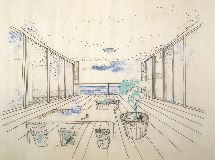
Drawings of La Maison au Bord de l’Eau, 1934
“Most of Perriand’s architecture related to the question of leisure; be it little weekend homes or ski resorts. She was wrestling with how you could give the masses access to leisure. She was entering a new world where people had more free time and things that previous generations hadn’t necessarily had, such as weekends and paid holidays.
“Perriand produced a number of designs in the mid-1930s that were cheap weekend homes, easy to either build yourself or get someone to build for you. This was one of those.
“There’s something about the way all the rooms open onto that little courtyard and the idea of looking out to sea that’s absolutely enticing. It’s so modest and so seductive.
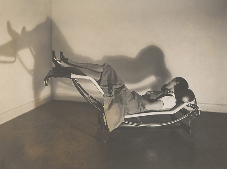
Chaise Longue Basculante B306, 1928-29
“What’s interesting about the chaise longue is that it continues that language of kind of machine aesthetic efficiency and modernist materials; this idea of furniture as equipment. But it’s incredibly elegant and comfortable.
“Some of the early tubular steel designs by designers like Mies van der Rohe were quite functional and not necessarily as elegant or as comfortable as what Perriand produced a couple of years later.
“All of the chaise lounge drawings are done by Perriand. In the middle of the century when Corbusier wanted to put the furniture back into production under his own name alone, he couldn’t do it as he didn’t own the drawings. They were hers. That’s not to say that work is all hers but the drawings remind us that she was really needed.”
Table à six pans, 1938
“It’s a really important moment in her career. Perriand starts to turn her attention to wood and to nature in general. She starts to design these tables which are inspired by the objects she finds in nature, like stones and pieces of driftwood.
“They’re organic in shape. They have heavy wooden tops. They have a kind of flesh-like quality; she thinks of the legs like a woman’s thigh.
“Although there is this artistic sensibility, they’re also highly practical tables. They have six sides but only three legs so you can fit quite a lot of people around and create more space underneath for people’s knees. What I love about these tables is that she’s thinking about how many people she can bring together. It’s a very social table.
“It’s also a table that you can turn in many different directions so it can fit awkward small spaces. Throughout her career, she’s always thinking about how to achieve the best use of the space.”

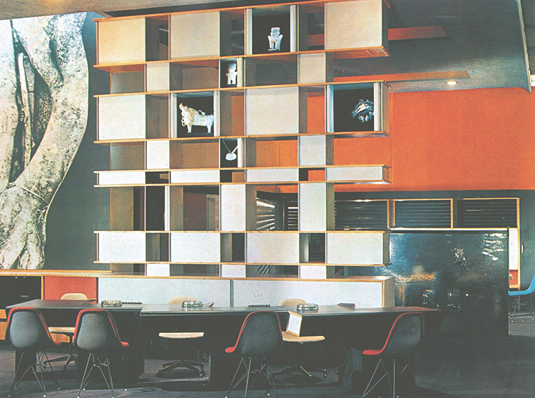
Bibliothèque, La Maison du Mexique, 1952
“It’s the signature Perriand work. First of all, you can assemble these shelves in different ways, using the same parts. She makes the consumer part of the creative process in a way because you can also arrange them differently.
“Her furniture is often architectural. So it’s not just a bookcase or a storage unit. it’s replacing a wall. It’s a spatial divider.
“The other thing I love about it is that it’s in the most modest room imaginable: a student dormitory. It’s such a design classic. It’s great design, but she’s making it available in a very humble setting because she believes that good design was for everyone.”
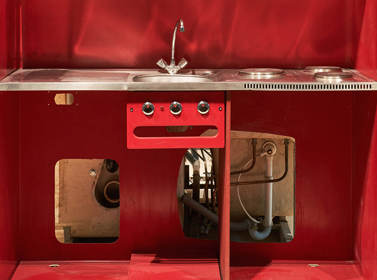
Prefabricated kitchen and bathroom, Les Arcs, 1967-1969
“It shows her thinking about prefabrication. She was a woman of her time trying to use the latest thinking and technologies to make construction more efficient. She put a lot of her energy into modularity.
“She understood that she had to build tens of thousands of hotel rooms for Les Arcs and that it would be much more efficient if you could just build the bathrooms and kitchens off-site, and then drop them into place. So that’s what she did.
“They have a very 1960s modular aesthetic so they’re timepieces. But it shows it shows someone who is both of that time and highly practical.”
Photography is courtesy of ADAGP, Paris and DACS, London 2021 and AChP.
