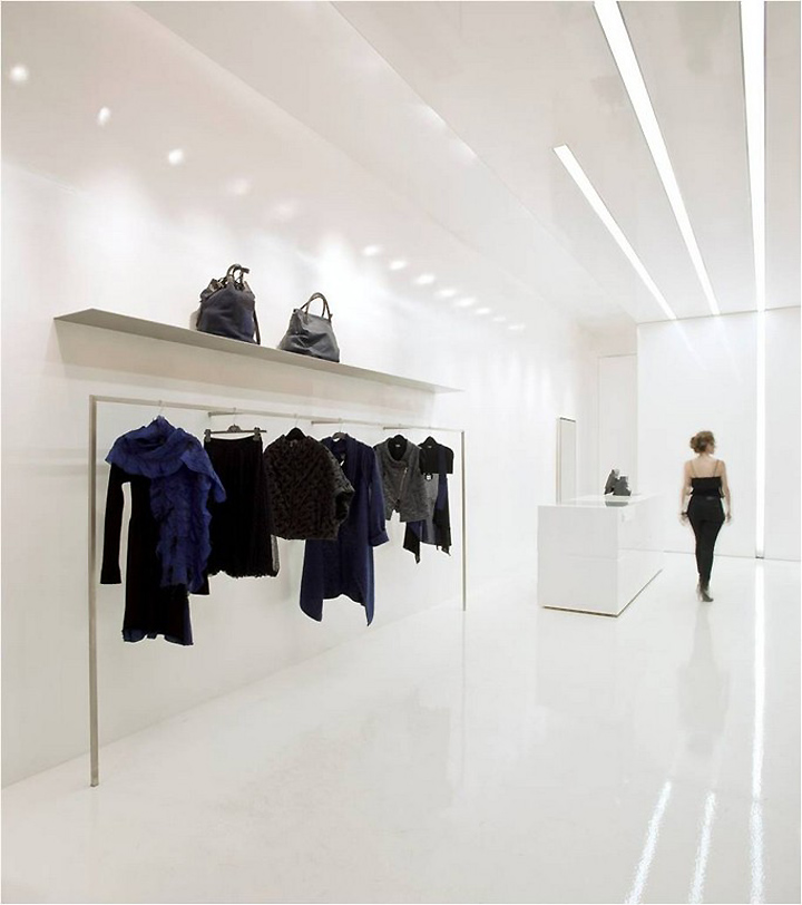
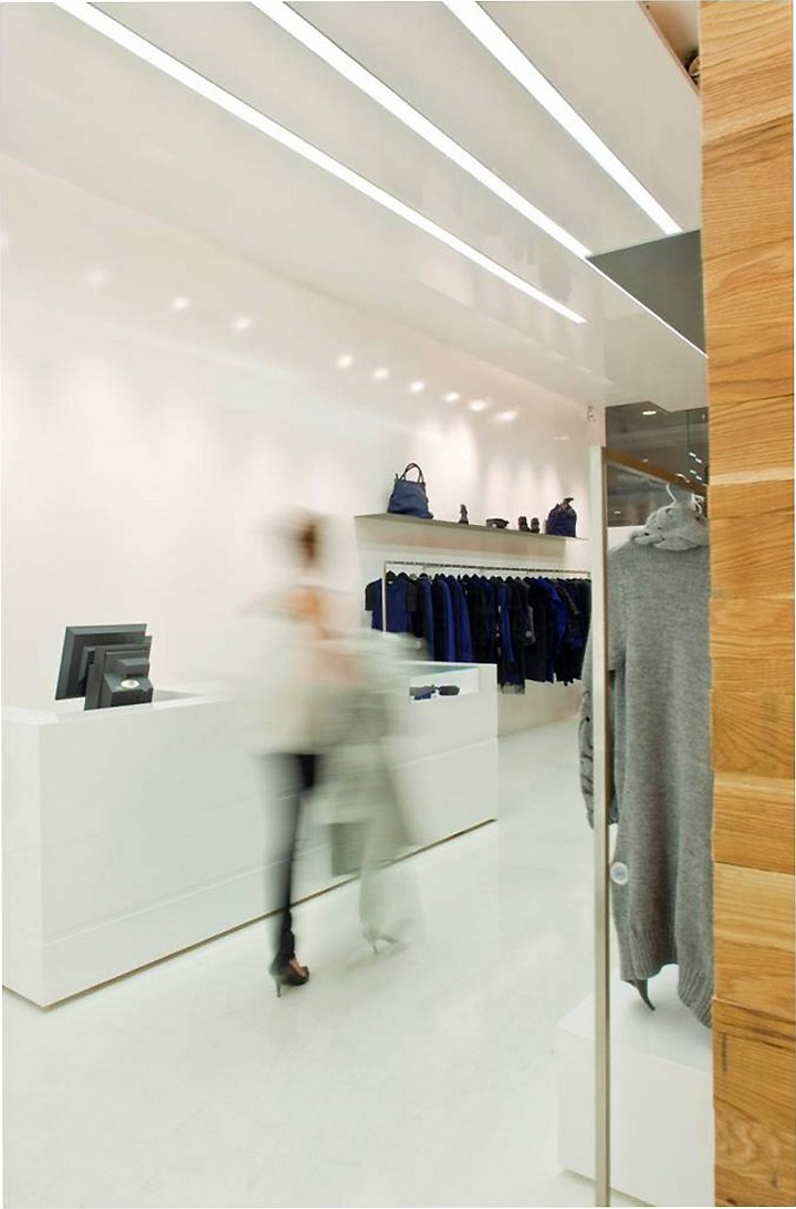
A small store of a Paris fashion house is situated in the heart of the Ramat Aviv Shopping Mall and invites customers inside, into a restrained and reserved world of design, a pure bubble almost completely encompassed by the loud and intensive marketing chaos of the surrounding mall. The aim of the designer was to create, in less than 50 square meters, a different world that invites the customer into a different shopping experience.
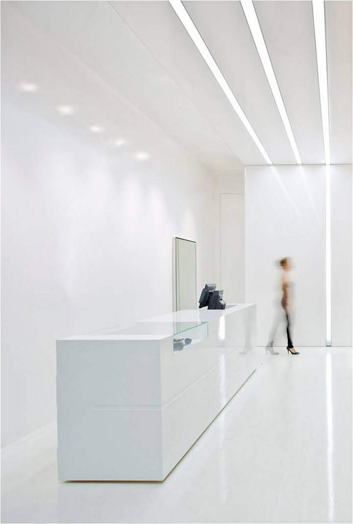
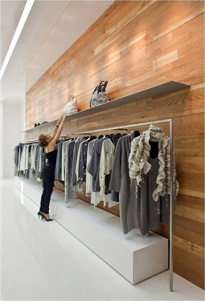
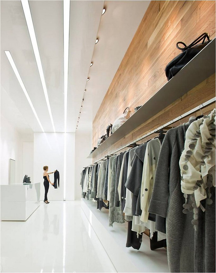
The result draws the observer into a geometrical grid, perfect and minimalistic. The polished form, the perfection of detail and the meeting of the different materials, the purity of language, meticulously and carefully styled , provides, for a moment, the feeling that we are looking at a picturesque, flat and almost two dimensional platform. The various and continuing white hued surfaces and the integration of the geometric light displays against the vertical and horizontal surfaces, offer the restrained picture a feeling of space and depth.
The aim of the designer was to create, against the background of a design and marketing environment that is both loud and provides instant gratification, a new, softer world, one that maintains the polished purity of minimalism down to the last detail. This new world is meant to create a different shopping experience, considering and tolerant. In a world where, for the most part, the demands of design on the display space overshadow the display itself (in museums, galleries and stores), the designer succeeds in not voiding the display but rather in emphasizing the uniqueness and quality of the fashion collection. This is achieved, not by neglecting the space's design, but rather through the relationship between the qualities of the materials, the structural restraint and the design polish.
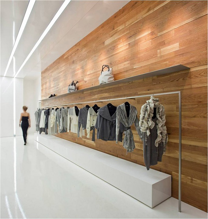
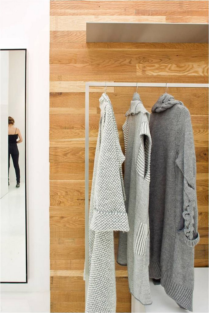
The use of white, glossy materials with a polished and smooth texture such as the white epoxy floor and the ceiling covered by a taut sheet of glossy white plastic, the creation of meeting and cut-off points that create continuous lines, the reflection of lighting strips at different levels – put together create, within the space, a visual illusion of an endless space with no definable boundaries and with no beginning and no end. There exists a feeling of reality within a bubble of purity, balanced and almost meditative. The connection with the materials, the textures and the feel of the textiles is created by a wall of solid oak that has been treated and aged and that is in direct contrast, both in its character and texture, to rest of the surfaces in the shop. The wall acts as a link and a bond to the endless feeling of floating and illusion that exists within the space. In order to preserve the completeness and design polish, the architect designed all of the accesories in the store including the thin stainless steel fixtures that are invisibly fixed to the wall, the woodwork pieces and the mirrors hanging on the wall with their slender frames that impart them an illusion of floating.


