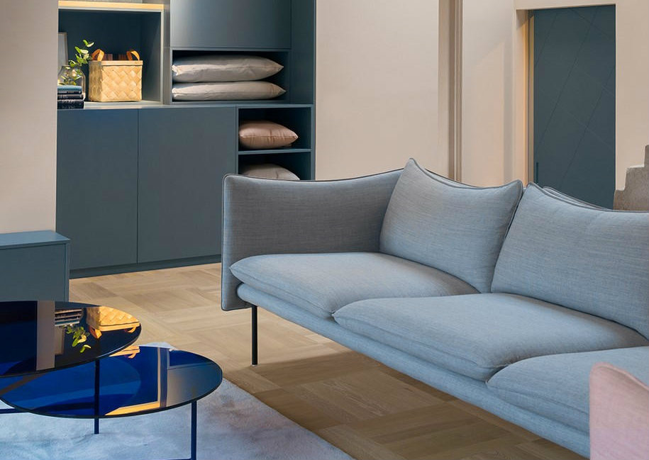
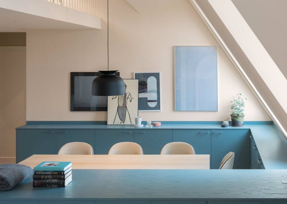
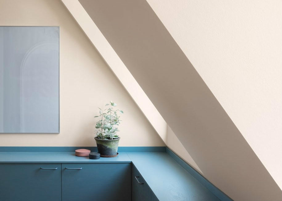
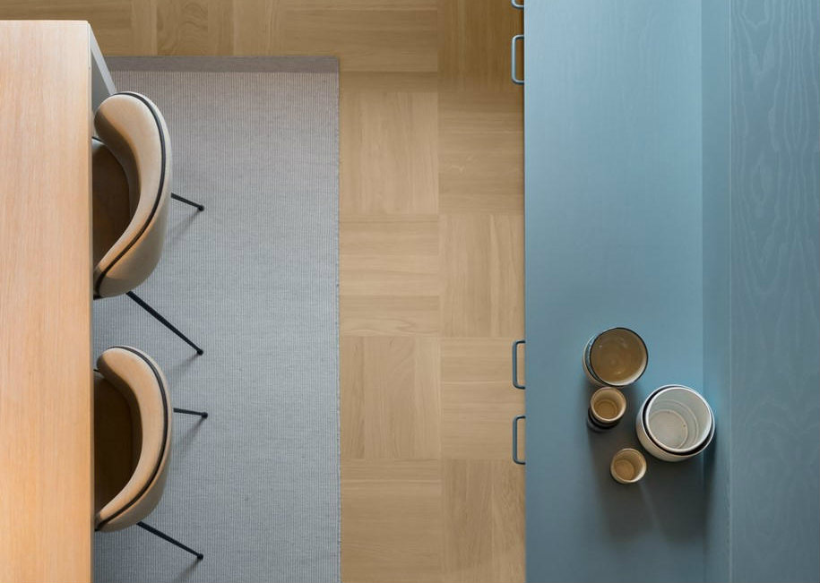
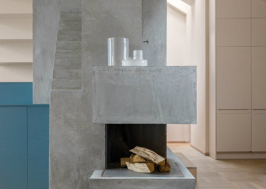
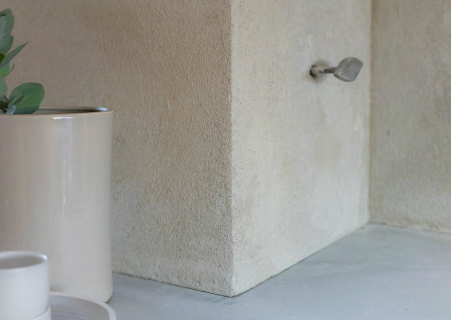
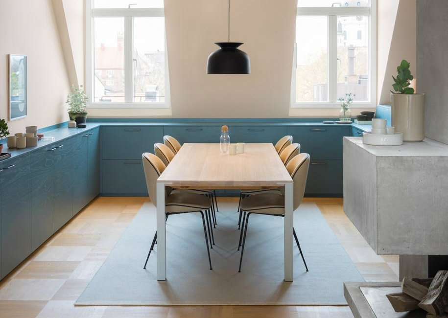
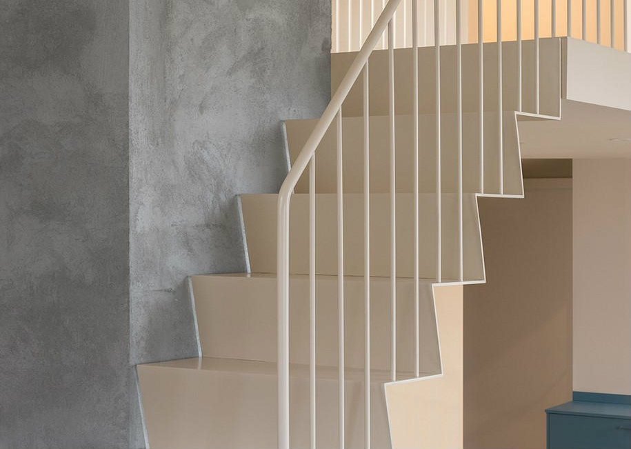
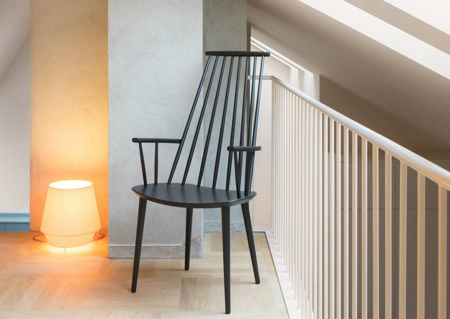
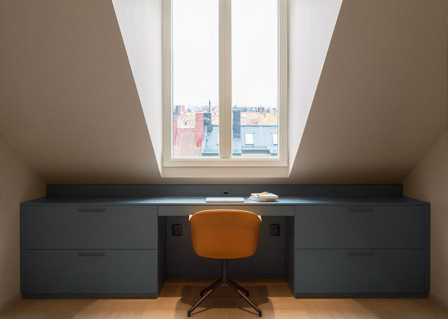
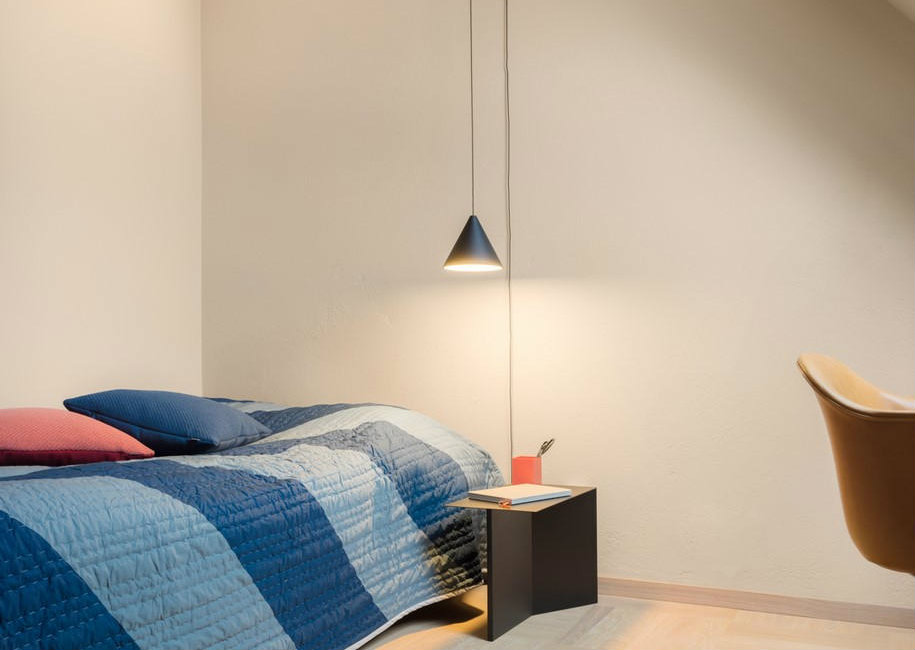
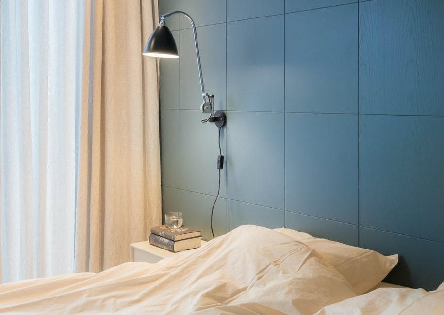
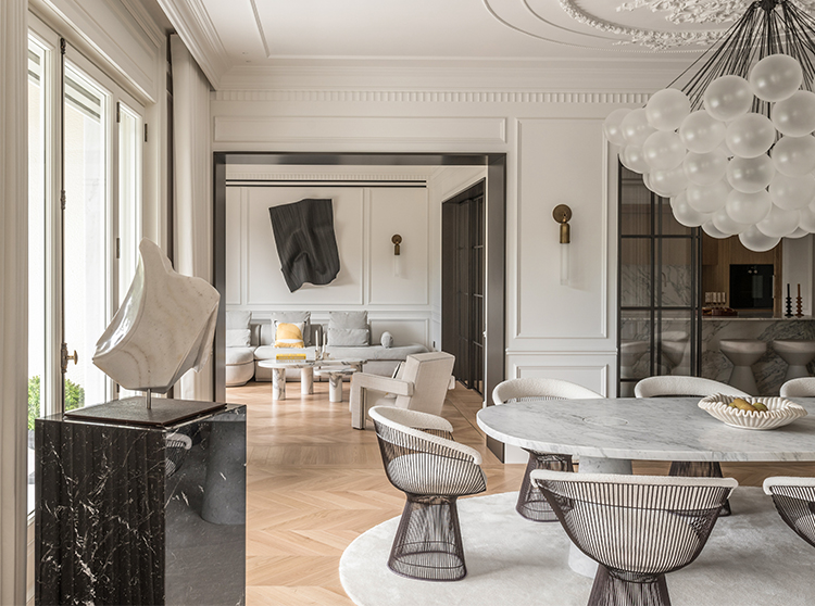
The house dates from the 1930s and went through many renovation during the years.When it was our turn to renew the the 200 square meter apartment our first step was to simplify everything we felt was too much, in terms of dimensions and materials. The task was to create a relaxed, soft environment and the main interior feature is a dark, low-lying base line that runs like a unifying horizon through the whole apartment.The blue-gray line works as a storage unit and becomes a base for the ceiling height to shoot off from. We utilize the loft’s steep niches in a simple way by filling them with really deep drawers. This framing of the rooms create a classic salon atmosphere, and becomes a wink to architecture of the old days.All walls and ceilings are painted in apricot pink and sandy beige tones which gives a soft, hazy atmosphere, creating a dynamic but gentle contrast to the blue-gray base. Nothing in the apartment is white.
Our client’s wish was for us to design a homely, yet representable interior. A place to live everyday family life, to be private, but with the possibility to be professional. A place to invite both business associates and good friends. Warm, welcoming, soft. Our client travels across the world – and so does her guests – which inspired a space of international character.In the beginning of the project we found three images which together became the foundation of the expression. The motifs: a brown cashmere coat, a pair of sand-colored sneakers and a plaza in Rome. Stylish but relaxed with an international look resistant to time. We looked for inspiration in environments with timeless character in elaborate and classic rooms. Spaces built in indelible, finely worked materials with carefully composed color palettes. We’ve aspired to reach a certain mood rather than a concept.
