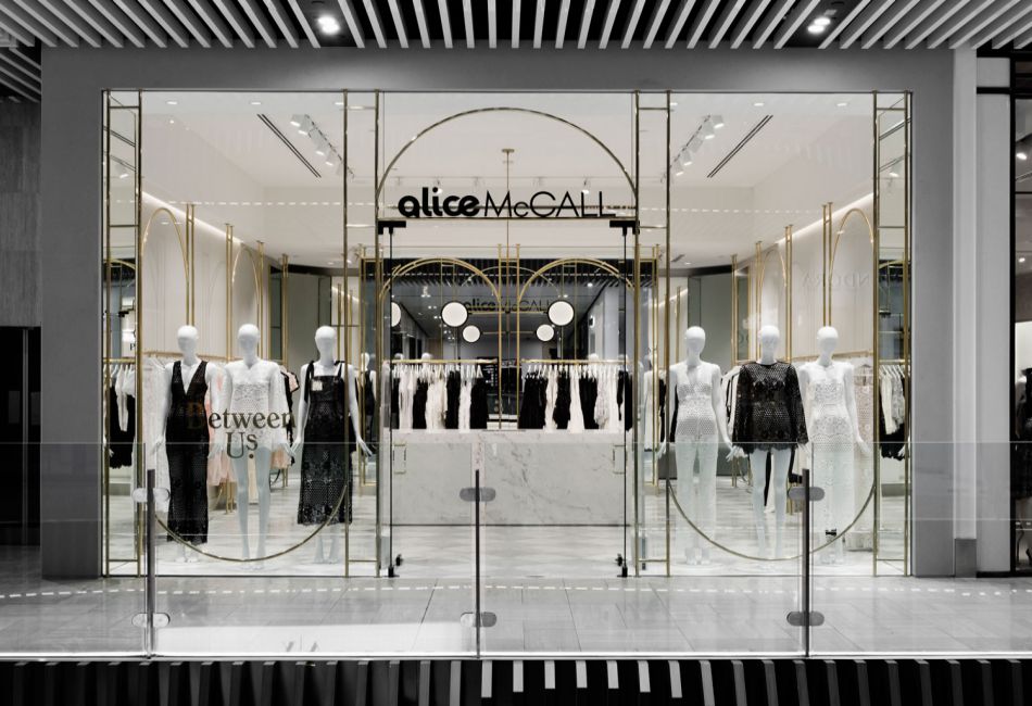
Following a long-standing relationship with Alice McCALL, Studio Wonder has developed a series of store design iterations in response to the evolution of Alice’s brand over the past five years.
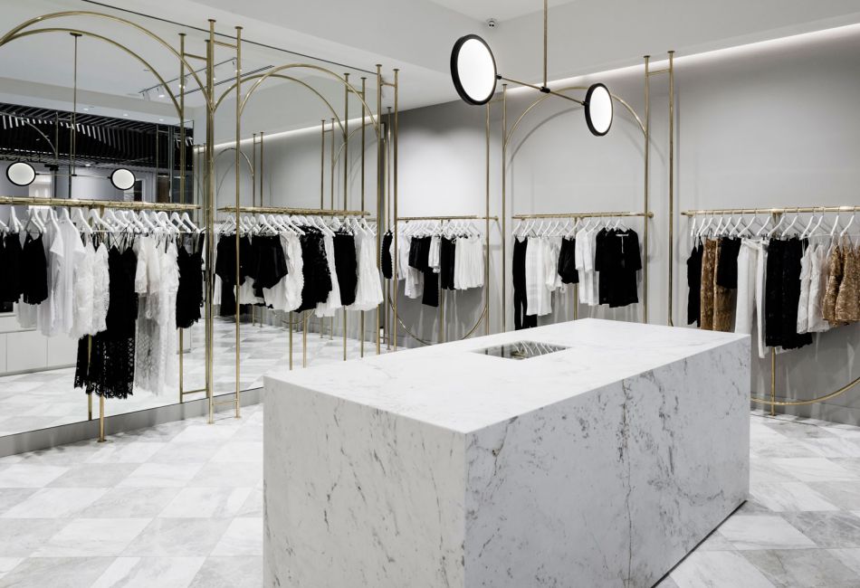
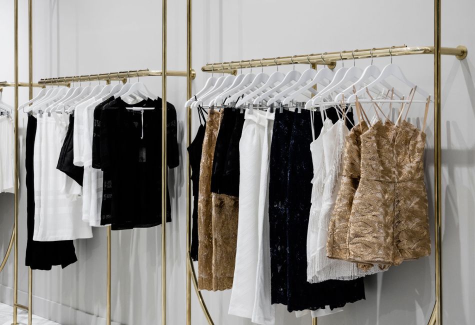
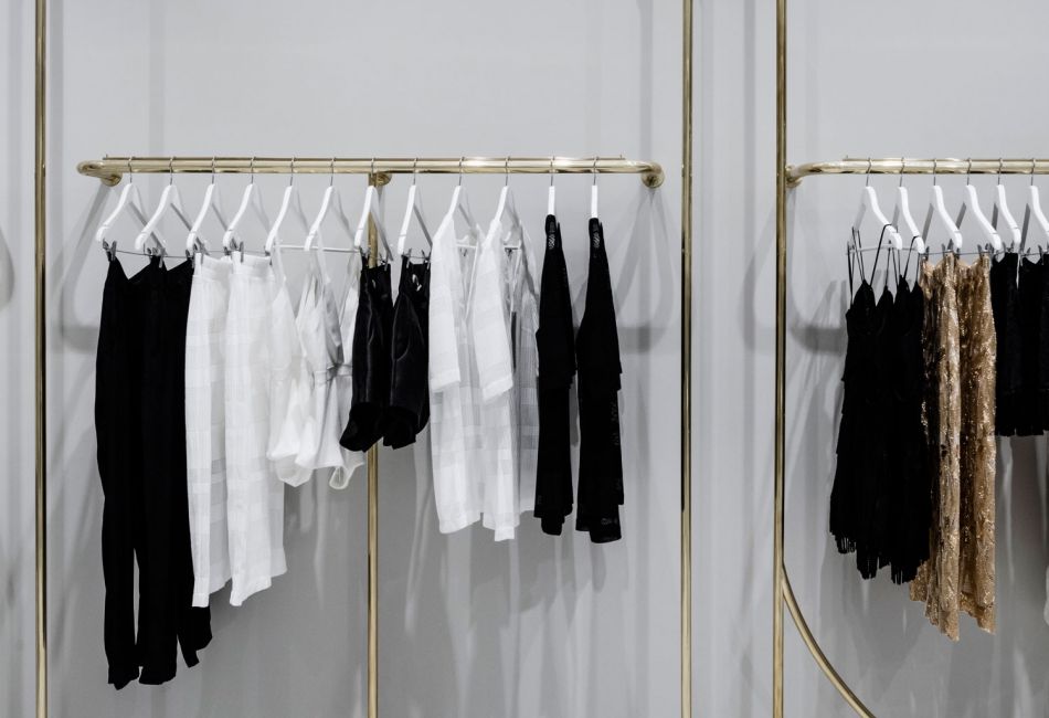
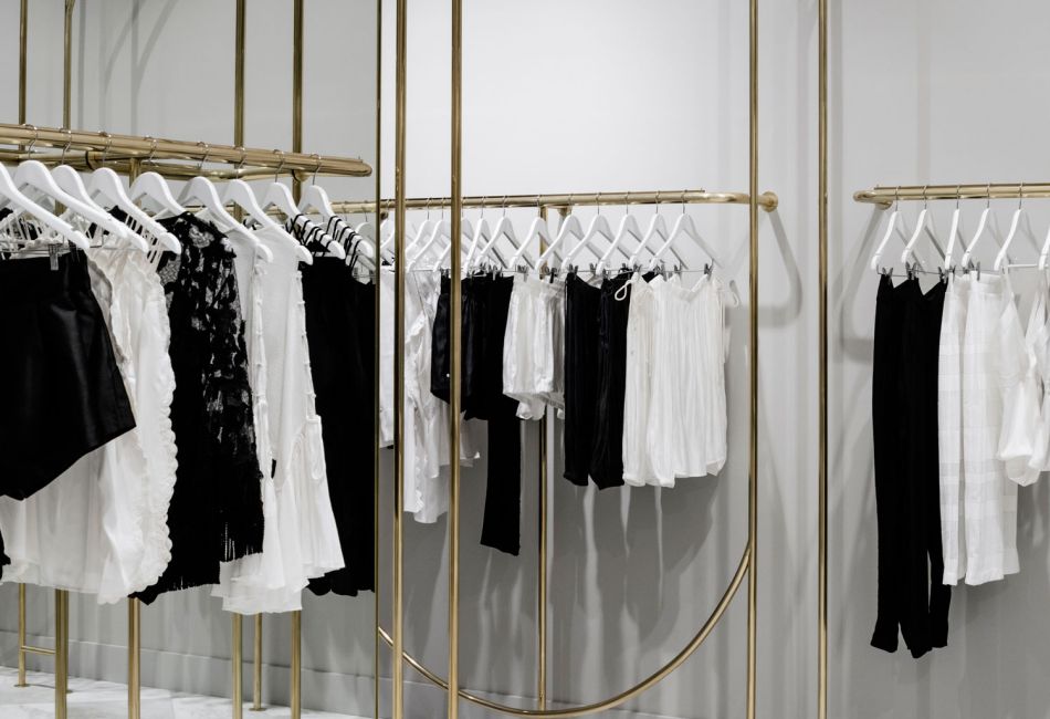
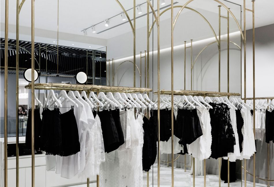
“Our most recent collaboration at Emporium Melbourne is a combination of our favourite elements taken from each store, resulting with a bright base palette of white and soft grey, accompanied with polished brass and black metalwork detailing,” explains Studio Wonder.
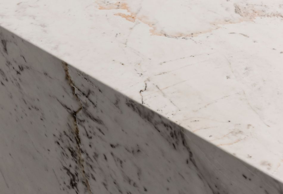
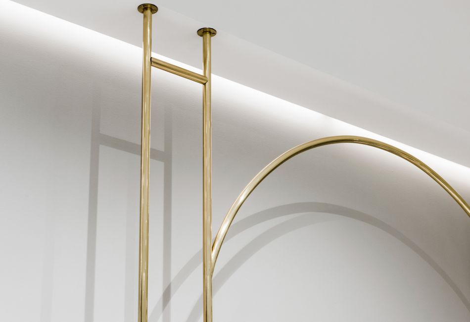
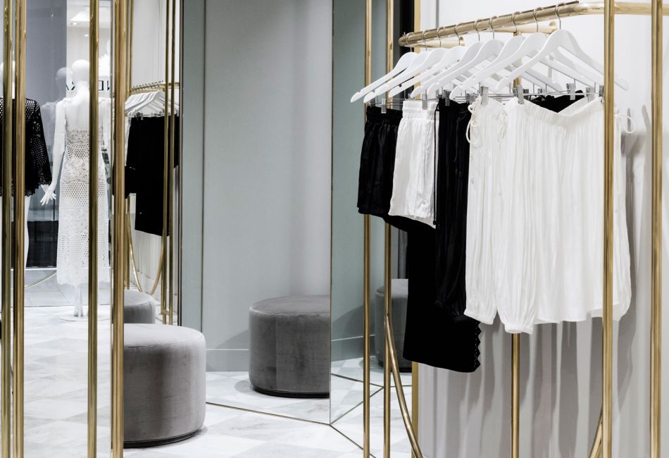
The aim is a striking, graphic, minimal space offset with polished brass archways ribboning around the store to highlight the colourful, feminine collections. The textured render of the store front frames large glass panels offering maximum sight lines into the store. A white/ grey checkerboard grid floor tile marks the sales area with a solid marble point-of-sale counter piercing through the centre.
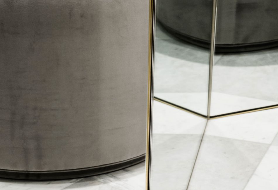
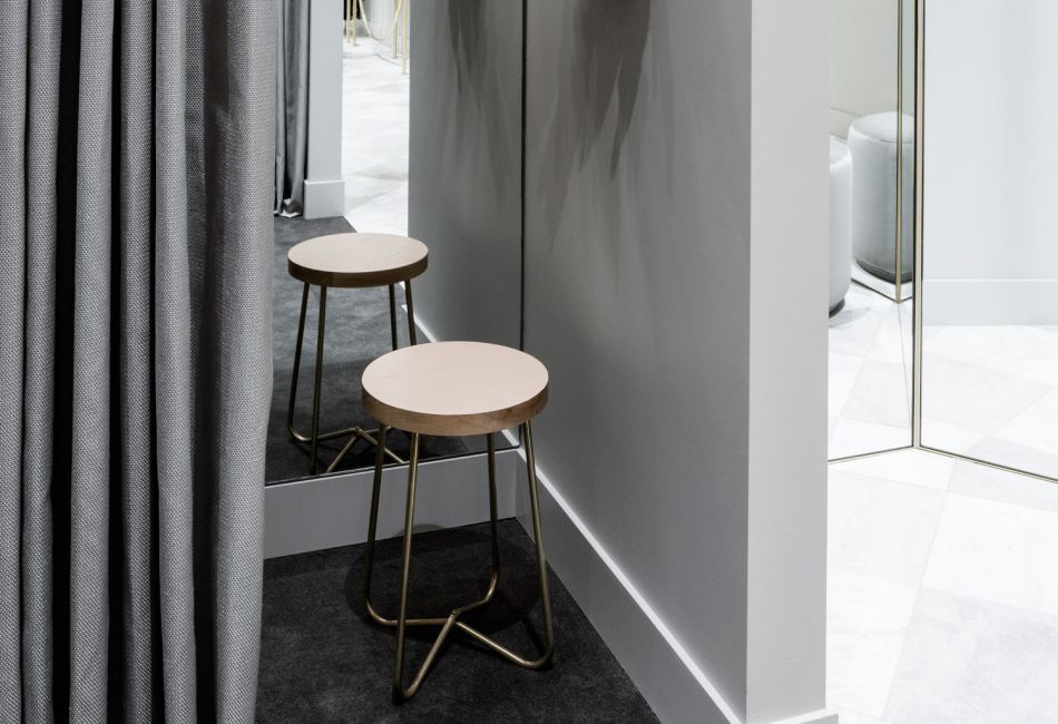
The central pendant is by Jamie Gray for Matter Made, sourced from Criteria Collection. Tucked behind the sales area is an expansive run of luxurious fitting rooms, including plush grey carpet, drapes, stools by Douglas & Bec and brass wall lights by Anna Charlesworth. Large mirrors strategically placed at the far corners of the store both service the fitting room area, while offering a play of reflections, glimpsing the sales area and producing a myriad of graphic patterns from the checkerboard floor.
